


How to Read Comics #2: In Waves
Analyzing what makes A. J. Dungo's In Waves so special.


Howdy, friend.
The biting flies are biting, the treefrogs and katydids are, nightly, making their music, and that syrupy humidity has returned—yes, it’s mid-July as I write this, and I’m astonished at how quickly this year has flown by. (I always am, I reckon.) Half of 2023 is over (!!!), and it’s hard to not start checking the notches on the proverbial wall to see what it is I’ve accomplished so far this year.
I have a major book deadline in August, so I’ll be putting off a full issue of How to Draw until next month. In the meantime, as I did previously with the graphic novel This One Summer, I thought it would be fun to explore another graphic project I’m thoroughly obsessed with, as well as what makes it so great: A. J. Dungo’s In Waves. The goal of How to Draw is, always, to have a discourse about what makes graphic projects of all shapes and sizes and forms work so well; my hope this month is to introduce you to this incredible book and walk through its beauty, effectiveness, and emotional resonance by analyzing a few pages.
If this is your first time visiting How to Draw, a hearty welcome. You can check out our archive here. And if you haven’t already, please consider subscribing so you don’t miss a thing.
‘Til we meet again. ♡
– RJR
“Out of the water, I am nothing.”
―Duke Kahanamoku
Published in 2019 and winner of the 2020 Eisner Award for Best Publication for Teens, In Waves skillfully weaves two narratives together. The first delves into the history and culture of surfing, exploring its origins and allure. The second focuses on the Dungo’s journey as he grapples with the devastating impact of cancer on his girlfriend, Kristen.
Dungo's artistic approach left a profound impression on me from the first moment I picked it up. His use of a minimal yet beautiful color palette complements his sparse illustrative style, creating a sense of simplistic, captivating grandeur. The emphasis is not on scrutinizing every detail but on allowing the work and its message to—pardon the pun—wash over us. We feel the loss, the grief and love, the healing, therapeutic power of the ocean.

For this book, it’s necessary to discuss INTENT. While described as a graphic novel, this work is deeply autobiographical, reflecting Dungo’s heart-wrenching struggle as he supported his partner, Kristen, while she battled cancer. This book itself is a tribute to her and her life, as well as what it means to cope with grief and loss and how we are able to find the resilience to push forward.
Artists do grow and change and can evolve distinct styles for different projects. When analyzing graphic works, we should always consider what the point of the story is (here: managing grief and loss, etc.) and how the author/illustrator has decided to best articulate this on the page in order to help us gain deeper insights into the narrative.
In an interview with SURFER Magazine, Dungo says of his style:
I definitely employ an economy of line in my work. I try to only illustrate what’s necessary which results in sparse images. Line quality is an important feature to me, stylistically speaking. It requires a focus and sensitivity that resonates with me.
The reason for the two colors delineating each narrative was that it was a way to ground the reader in the timeline they’re reading. Sepia was a pretty obvious choice for the past narrative as it is reminiscent of old, fraying film, and I picked blue for the present because of that color’s connotation to sadness.
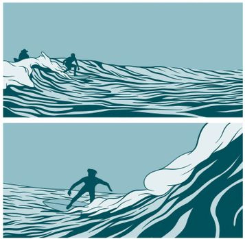
Here’s a sample of the two narratives and how he knits them together with these different color palettes:

And in an interview with Salty, Dungo reiterates what the ocean means to him:
I think it’s a place of refuge. A place to escape. A place to spend time with others or a place to spend time alone. It’s a place that makes you feel in tune with nature. It’s a place that makes you think. A place of pure fun and wonder.
So not only are we reading a story about Kristen and her cancer and how Dungo dealt with it, as well as the history of the sport they both loved, but this is also about the immense tranquility of the ocean, being out there on a board, allowing your life to be dictated by nature and the sort of ontological, stoic philosophies it inspires in its worshippers.
Let’s check out and dissect a specific two-page spread I think about often:
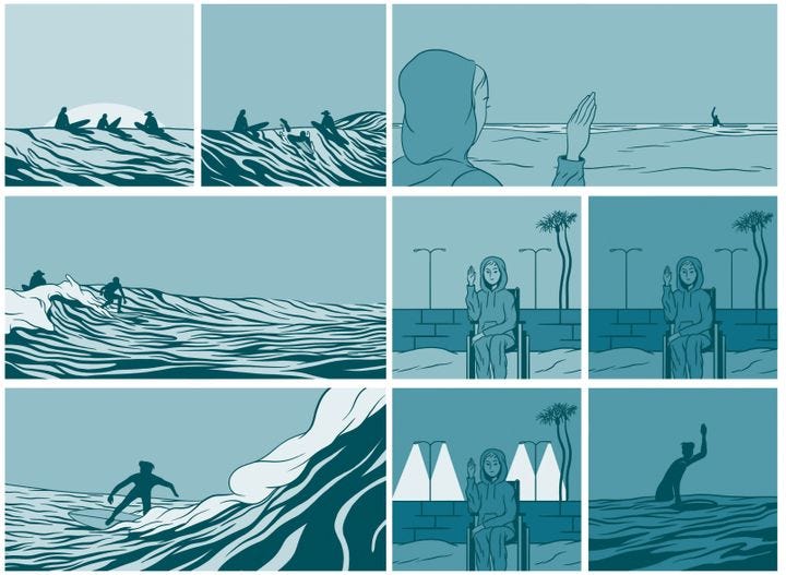
Dungo's linework may seem clean and straightforward, but his visual storytelling holds unexpected complexity. The blue palette indicates the autobiographical “sad” narrative, grounded in his memories. We anticipate the emotional tone of these pages based on the blue colors, distinct from the sepia-toned historical narrative. Subconsciously, we enter these pages prepared and emotionally engaged. Ready.
In the first couple of panels, we find silhouetted surfers—Dungo, Kirsten’s brother, Jeff, and her cousin, Eon—in various states of catching and riding waves. The sky in these first few panels is massive, taking up the bulk of the space. (I won’t call this negative space because we are meant to intone this as an endless-seeming sky, the sun setting, the world slowly dimming.)

In the next two panels, the waves take over the bulk of the composition (simply: the arrangement of visual information within a panel). From this decision, we are meant to intone their might. Perhaps, too, the obsessiveness of the surfers, how much this sport takes up in their heads.
This page seems simple, but it intricately captures the profound connection these people have with the sport and the ocean. It portrays the rawness and awesomeness of their experience, how they surrender to the unpredictability, waiting for that perfect wave with uncertainty about their ability to ride it. Dungo's art avoids unnecessary details, keeping our focus instead on the essence: the ocean's immense power and significance. Its enormity.
In the first panel on the next page of this spread, we see Kristen waving to these same surfers we just spent time with.

Graphic novels and comics owe much to filmmaking, and understanding related terms and techniques can be helpful. In the first panel, Dungo uses a low-angle shot: Kristen is in the bottom left corner, while the ocean, horizon, and the lone surfer—Dungo—waving back to her, dominate the composition. Low-angle compositions can serve various purposes, portraying importance, dominance, or psychological unease. Here, though, the low-angle shot conveys vulnerability and weakness: Kristen appears small and faint compared to the water and sky, symbolizing her powerlessness and longing to return to the water. This struggle is evident even without text, making us feel further connected to Kristen: we feel small, too, lingering with her. Additionally, this panel again highlights the ocean's vastness and allure—a sense of helplessness being out there, yet finding a way to harness its energy to ride the waves and experience a surge of adrenaline.
Then, a shot-reverse-shot reveals Kristen on the beach, where she’s been all along.

*A shot-reverse shot is a filmmaking technique where the camera alternates between showing different characters’ perspectives.
In the first three panels: Kristen is wheelchair-bound as the sun sets causing the parking lot lights to click on behind her. The contrast with the previous page is stark: she and the manmade surroundings dominate these three panels—the brick retaining wall and the parking lot lights—making us feel confined and helpless, trapped. In contrast, the surfers on the previous page appear overwhelmed by the boundless ocean, yet there is a sense of freedom in their fluid movements.
Everything with Kristen here, though, is squared off and fenced in. The last panel shows a silhouetted surfer taking up the same space as Kristen in the previous three panels, but there's a certain liberation there: the surfers are free from the constraints of society, of obligation and sickness. At one with the waves. We literally watch the passage of time while all Kristen can do, unchanging from her vantage, is signal back.
Only comics can tell a story like this; unlike film, where shots eventually transition, comics allow us to linger, embracing the ocean's hugeness and delving into the book's emotional depth at our own pace. Consider: In Waves delivers everything we need to know about Dungo and Kristen’s emotional journey in just nine panels—no text, just a brutally honest exploration of what life gives and takes away, what and who we spend our time loving. As we read on, we're hit by its true depth and stylistic choices, finding a liturgy on moving forward, persevering, and making peace with loss. These pages immerse us in the water, the sun, and the board, all becoming some kind of benediction.

Thanks for this great introduction (for me) and guide through these beautiful pages!
Love the color use in this work especially