


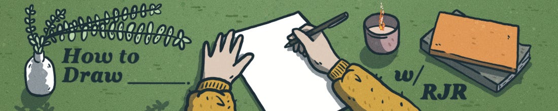
How to Draw (with Color)
The emotional logic of color and how it shapes the stories we tell. Plus: An introduction to color theory, Alison Bechdel's Fun Home, hex #65CCF1, and more.

Howdy, friend.
I went back and forth on whether to send a newsletter this month. There’s so much happening in the world, and it feels oppressively overwhelming—the news, the grief, the sheer weight of everything.
And yet, I’m still working on my book. Still drawing, still reading, still collecting ideas about art and talking to friends about why it matters. Because it does matter. Art is one of the ways we share hope, offer love, and connect our worlds—and that feels more necessary than ever.
So this month, I’m bringing it back to basics, a look at one of the foundational pieces of comics-making: choosing your color palette and the power that comes with it.
If this is your first time visiting How to Draw, a hearty welcome. You can check out our archive here. And if you haven’t already, please consider subscribing so you don’t miss a thing.
Stay safe and be well. ♡
– RJR
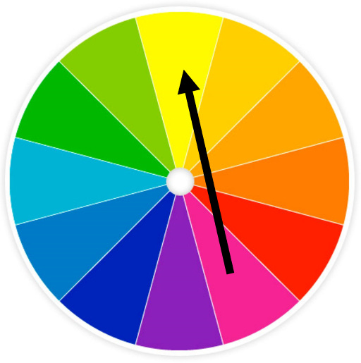
First, a crash course in color theory.
Colors (often) carry symbolic meanings that can reinforce narrative and characterization in comics. For example, red might symbolize danger or passion, while blue could represent calmness or melancholy. Using color symbolism effectively can add depth and resonance to your storytelling. Warm colors (reds, oranges, yellows) tend to evoke energy and warmth. Cool colors (blues, greens, purples) suggest calmness, tranquility, and depth.
Understanding the emotional and symbolic weight of individual colors is only part of the picture. Just as important is how colors interact with one another on the page. The way colors are paired or contrasted can dramatically impact a reader’s perception and emotional response.
Complementary Colors
Colors that sit directly across from each other on the color wheel—like red and green, or blue and orange—are known as complementary colors. When placed side by side, they create vibrant contrast and visual energy.
What makes them so effective? These color pairs activate different parts of the eye at once, creating a sense of balance and intensity. That’s why they’re often used to make characters or moments stand out on the page without overwhelming the viewer.

Analogous Colors
Analogous colors are groups of three or more hues that sit side by side on the color wheel, like purple, blue, and blue-green.
Because these colors are closely related, they create a natural sense of harmony and cohesion. The result is a smooth, unified look that’s easy on the eyes, perfect for conveying mood, setting, or atmosphere without sharp contrast.

Discordant Colors
Discordant colors are combinations that clash rather than blend. They sit far apart on the color wheel, and instead of soothing the eye, they create tension, discomfort, or surprise.
Used intentionally, discordant color schemes can jolt the viewer, disrupt visual expectations, or highlight emotional unease—perfect for moments of conflict, chaos, or psychological depth in a story.
Monochromatic Colors
Monochromatic color schemes use variations of a single hue—shifting in lightness, saturation, or value—to build a scene.
One of their biggest strengths is the sense of cohesion they bring. By focusing on one color family, you can create emotional depth, visual consistency, and mood without the complexity of juggling multiple hues. It’s a smart, minimalist approach that still packs a punch.

Consider the following five ducks, each identical in form but colored with a different scheme:
(1) Primary (2) Complementary (3) Analogous (4) Discordant (5) Monochromatic.

Pay attention to how the mood, focus, and energy shift with each palette. Same duck, entirely different vibe.
Color is a mighty tool that comics makers must learn to flex. Your use—or purposeful omission—of color is, next to your linework, one of the first ways a reader is drawn into a graphic project.
In my recent graphic essay about the Nebraska National Forest, published in The New Territory, I leaned into a full palette to evoke the lushness of the landscape—and to let the colors help carry the story.
But a full color palette takes time. Not just because you’re picking colors, but because you’re making decisions about how those colors interact—what complements what, what pops, what recedes, and how to guide the eye through the page.
Even a single image, like this cover illustration I made for Great Plains Quarterly, took a long time to get just right. I had to balance the colors, highlight the right subjects, and make sure every element pulled its weight visually.

That’s one reason many artists choose a limited palette. One of my favorite examples is R. Kikuo Johnson’s No One Else, a book that follows an overworked single mother, her grieving son, and her estranged brother as they struggle to reconnect after their father’s death.
The book uses a two-tone complimentary palette: blue dominates, evoking exhaustion and grief, while orange appears sparingly, marking emotional peaks and symbolic moments.
Alison Bechdel’s Fun Home also uses a limited palette—washed-out blues and teals that evoke old photographs and emotional distance. The muted tones quietly reflect the book’s themes of memory, grief, and repression, adding atmosphere and emotional weight to the story.
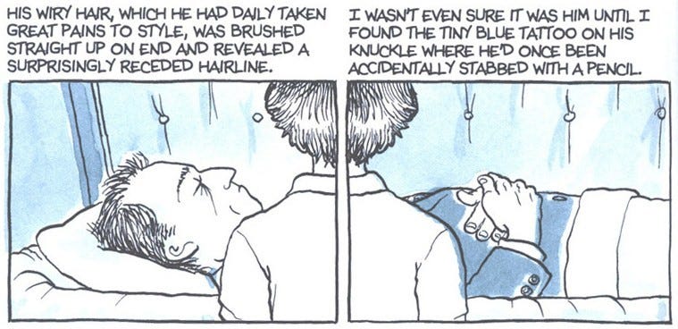
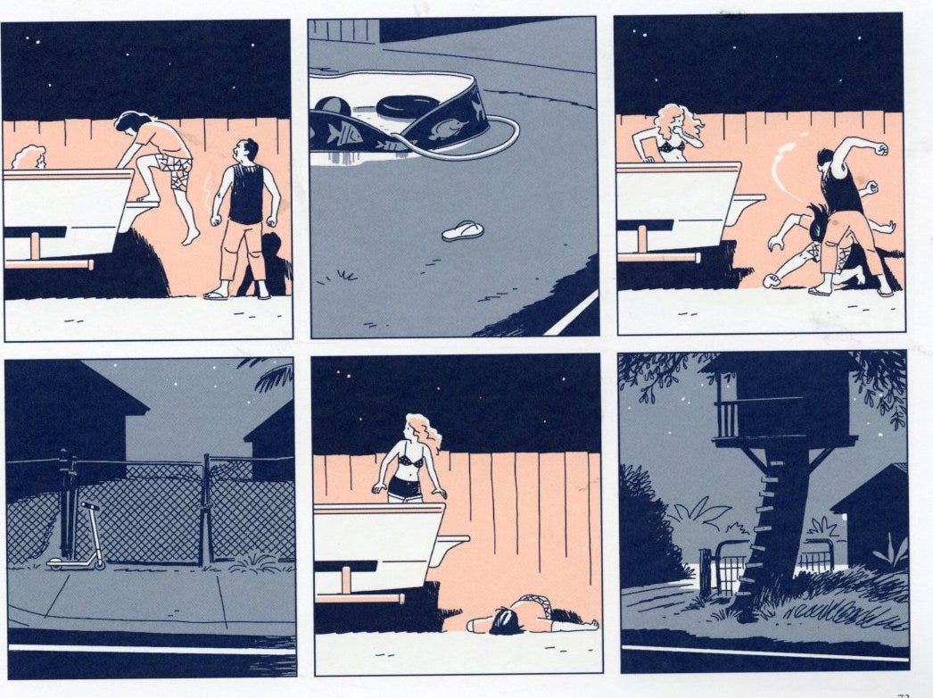
For my book, Hard Body, I decided early on not to use full color. A limited palette felt more appropriate—locking in the palette from the start has helped me avoid choice paralysis and stay focused on the story and the art.
I didn’t have any parameters from my editor about using color, so I went with a grayscale foundation and added a single pop of pink—like the orange in No One Else—to accentuate key parts of the story.
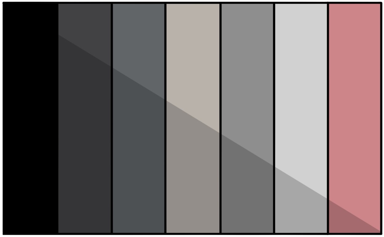
And because I love hex values, here’s the palette I landed on, from left to right:
#000000 - “Black”
#424243 - “Ship Gray”
#616568 - “Nevada”
#b8b2ab - “Tide”
#8e8e8e - “Gray”
#d1d1d1 - “Alto”
#ce8589 - “Puce”
I also use black at 20% opacity for shadows, giving each color two tones to work with.
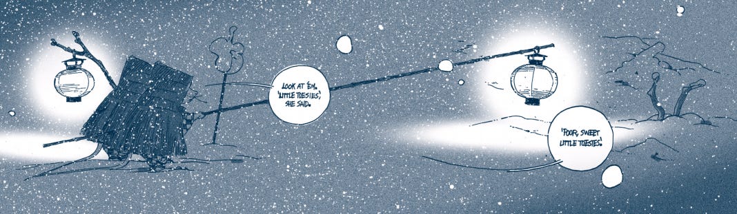
Below is a small selection of panels—not in sequence—that show how I’ve used this palette throughout the book.
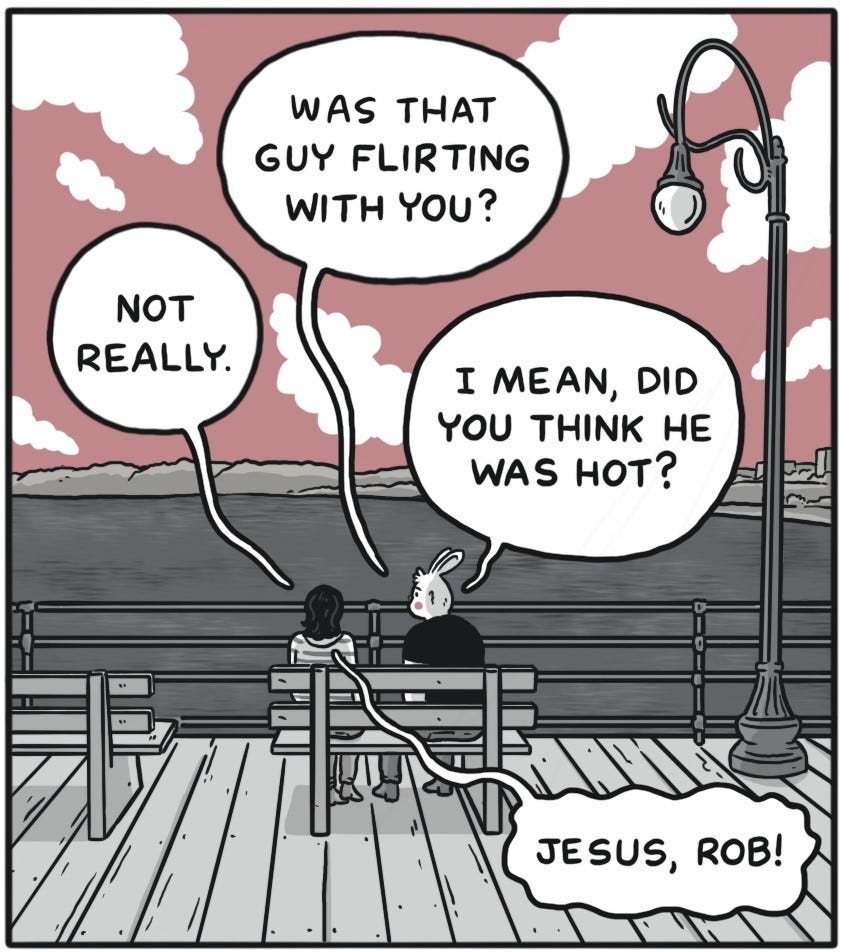
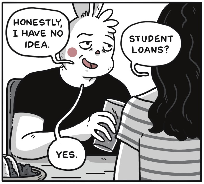
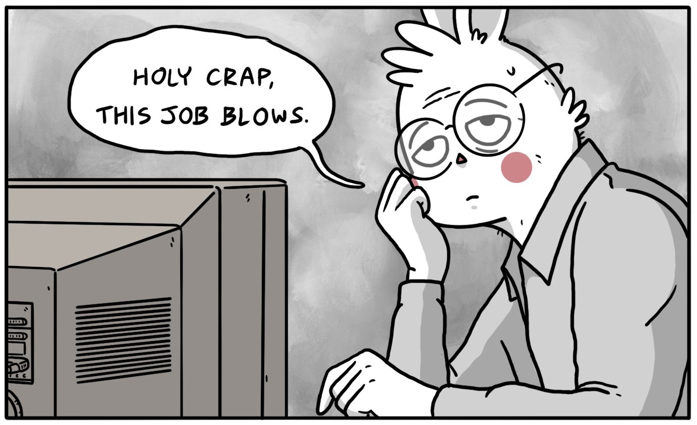
I begin every project by choosing the line style (smooth or scratchy, thick or thin), followed by the color palette. As much as anything else, that palette sets the tone of the work. And understanding how colors work together—rather than just choosing what you like—is essential to telling a story that holds together.
If you’re newer to color theory, a great place to start is Adobe Color, a free tool that lets you experiment with palettes and explore different harmonies—analogous, complementary, and many more. It’s a wonderful resource I still use regularly.

What I’m reading:
Graphic: Thieves by Lucie Bryon
Graphic: Cornelius: The Merry Life of a Wretched Dog by Marc Torices
Graphic: A Frog in the Fall (and Later On) by Linnea Sterte
Graphic: Are You My Mother? by Alison Bechdel
A perfect panel:
A Frog in the Fall (and Later On) by Linnea Sterte
The color I’m obsessed with right now:
hex #65CCF1 – “Malibu”


Thank you for this free wonderful lesson. I’m a newbie and choosing colors are hard, but your post helped me understand it much better!
Agreed! Another grateful newbie here. I love your examples. I also love that you’ve included a current color obsession, that’s fun! 🤩