


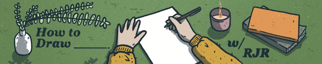
How to Draw (Stillness)
How to Draw (Stillness)
Crafting stillness, the quietest place in the U.S., Cliff Chiang, hex #c7cfcd, and more.

Howdy, friend.
Last April I took part in a four-day silent retreat. (Here’s a diary comic I made about it.) I did this in part to test myself. See, I talk a lot. Know me for a minute and you can attest to this. Here was an opportunity to question how and when I talk—to dissect what I think I know about myself and my need to communicate. It was revelatory. I’d keep my phone in my room and explore the grounds of the retreat center. I cataloged birdsong, my footfall, the wind through the young sycamore surrounding the cabins. I focused on my senses, what I was taking in and processing with none of my usual distractions.
There is a natural correlation between stillness and quiet, I think. Are they the same thing? Not quite: Stillness refers to the absence of movement, while quiet refers to the absence of sound. You can be still and loud; or quiet as you move. This month—because comics are not an auditory medium—we’re going to focus on how and why we present stillness on the page, this idea of presenting a lack of movement and action as a tool to heighten meaning and story. I may use stillness and quiet interchangeably here and there, but in a 2-dimensional medium that produces no sound, I’m referring to the inaction, the placidity.
If this is your first time joining us in conversation at How to Draw, a hearty welcome. You can check out the archive of past posts here. I have subscribe buttons sprinkled throughout this post—please consider signing up so you don’t miss anything. My goal with this newsletter is to create conversation. Not an artist or comics-maker? Totally fine. Maybe there’ll be something here you can pull into your writing, or at the very least, I hope you’ll revisit comics as an artful, layered storytelling medium with new knowledge of what makes them so great.
Wherever you are, I hope you’re enjoying the coming spring and the glorious rebirth that happens all around us this month. What better time to push ourselves to rethink who we are, where we’re going, or how we express ourselves through our work? ♡
– RJR

“Silence is not the absence of something but the presence of everything. […] It is the presence of time, undisturbed. It can be felt within the chest.”
―Gordon Hempton, Acoustic Ecologist
I have long been obsessed with stillness and quiet. When I first watched the 2010 documentary Soundtracker, I began to really try to investigate my relationship with sound and movement and the “need” to be stimulated (something I still struggle with). The film chronicles author and sound recording specialist Gordon Hempton’s One Square Inch of Silence, a “noise control project” protecting the quietest place in the U.S., a very literal square inch of space in the Hoh rainforest in Washington’s Olympic National Park. (This short film on Hempton and his work is worth checking out.)
I dug deeper, craved more understanding of how loud our world is and how we interact with noise. Some ephemera:
The quietest place in the world is an anechoic chamber at Orfield Laboratories in Minneapolis, Minnesota. The chamber is so quiet that the background noise is actually negative decibels (-9.4 dBA). This means that it is quieter than the sound of your own body. Those who enter the chamber report being able to hear their bones scrape against one another, their blood whoosh in their veins. Journalist Joe Penna stayed in the chamber for 2 hours and 45 minutes and said that the experience was "the most terrifying thing I've ever done."
John Cage’s 1952 composition 4’33” is four minutes and 33 seconds of silence. The performer—all dolled up—sits at a piano and does not play a single note. Through this silence, the audience begins to hear the ambient sounds of the environment, the audience, the creaking of the concert space, the sound of the outside world bleeding indoors.
The World Health Organization published a report in 2011 that examined and quantified the health burden of noise in Europe. The report found that noise was causing the loss of one million healthy life years every year for the 340 million residents of Western Europe, as well as a variety of health problems, including heart disease, stroke, diabetes, and mental health problems.
The Hum is a mysterious low-frequency noise that has been reported all over the world. It is a persistent and invasive sound that can cause a variety of health problems, including sleep disturbance, anxiety, and depression. The source of the Hum is unknown, but it is thought to be caused by a number of factors, including industrial activity, wind turbines, and military activity. It’s a mystery that many across the globe are obsessed with.
In comics-making, then, how do we present quiet/stillness?
Quickly, the goal of this newsletter is not to pit WRITING against GRAPHIC WORK. They are distinct mediums that serve unique storytelling purposes. But I think we can ask ourselves what one does better versus the other, and how we can use these differences to our advantage. The written word is a powerful tool for describing a scene, but it is limited in its ability to convey the full range of visual information that a graphic novel can. A graphic novel can use images, panels, and color to create a more vivid and immersive experience. For example, in a graphic novel, the reader can see facial expressions and body language, providing clues about emotions and intentions. In a written description, the reader would have to rely on the author's words or context clues to convey this information.
Both of these approaches work, of course, but what draws me to the graphic form is the immersion. I feel gnomic in the pages of an illustrated story, a watcher visiting a vast world.
In traditional writing, you can achieve stillness as a world-building technique, but—hot take—we are limited by the words themselves. We rely mainly on our sense of sight to interpret words on a page. We scan the text, visualize the scenes in our minds, and form mental images of the characters and settings. That’s powerful, but that’s where our sensory experience ends.
In comics reading, we also rely on sight, but we add to it our sense of spatial awareness and our ability to interpret visual symbols. We take in the images and text simultaneously, and our brain processes them together to form a cohesive narrative. We also pay attention to the layout of the panels and the placement of the text, which can convey important information about pacing and tone. (More on the latter shortly.)
See: Do a Power Bomb by Daniel Warren Johnson

There is an enormity present in graphic work that offers what the written word alone cannot. The use of full-page illustrations or double-page spreads can create a sense of vastness and grandeur unattainable in another medium. Similarly, the use of empty panels or white space (we call this negative space) can create a sense of quiet and stillness that can emphasize a particular moment or emotion. Through these lulls we feel a deeper connection to the characters and the world they inhabit. We are pulled in, we linger. We can view again and again and discern more at each pass.
So, instead of HOW to draw stillness, we might better interpret this as WHY we draw stillness (with the HOW to surely follow).

First, I think it makes sense to look at movement on the page, the opposite of stillness and quiet, and its function.
In a grand storytelling sense, there must be movement—we can’t have an entire narrative where a character sits in a single position and never wavers and nothing ever happens. (Or, can we?) We associate movement as action; therefore, movement and frenetic energy show us ways in which characters interact with others, push themselves throughout and engage with the world, how they live their lives. It can also be used to convey emotion, such as fear or surprise. Movement—pacing, forward-moving plot, inner growth—is essential to any story.
However, not all movement is created equal in comics. Japanese mangas are, perhaps, the epitome of motion. Just look at this sample from Naruto:
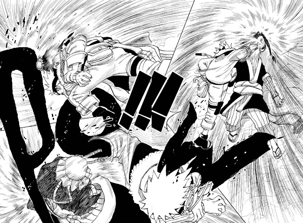
To create literal indications of movement, like we see in the above example, an artist can use action or speed lines, which are used to indicate movement. These lines can be straight, curved, or jagged, and they can be used to show things like running, jumping, or flying.
Movement can also be created with panel transitions. Panel transitions are the way that panels are connected to each other and each type of transition can create a different effect. For example, a jump-cut transition shows a sudden change in action. Or a page with a lot of panels may show a progression of small movements or actions emulating a full choreography playing out.
Let’s take a look at American-style superhero comics. These are (typically) big action spectacles created to ensure readers get the most for their money. There’s lots of drama, lots of action. For example, this sample from the exquisite mini-series Catwoman: Lonely City by Cliff Chiang:

Here, a sequence of many panels shows a tussle between Catwoman and Batman. Even with very little text on this page, there is a lot going on: background details, little forward movements in each subsequent panel, a vast color palette, and a very lived-in scene that doesn’t require us to do much heavy lifting mentally. This is a page that wants to offer up some form of connection between these two characters, but there is still an awful lot of noise here to discern much more than something surface-level and passing. This stillness is not quiet, nor is it contemplative.
Another page from Catwoman: Lonely City:
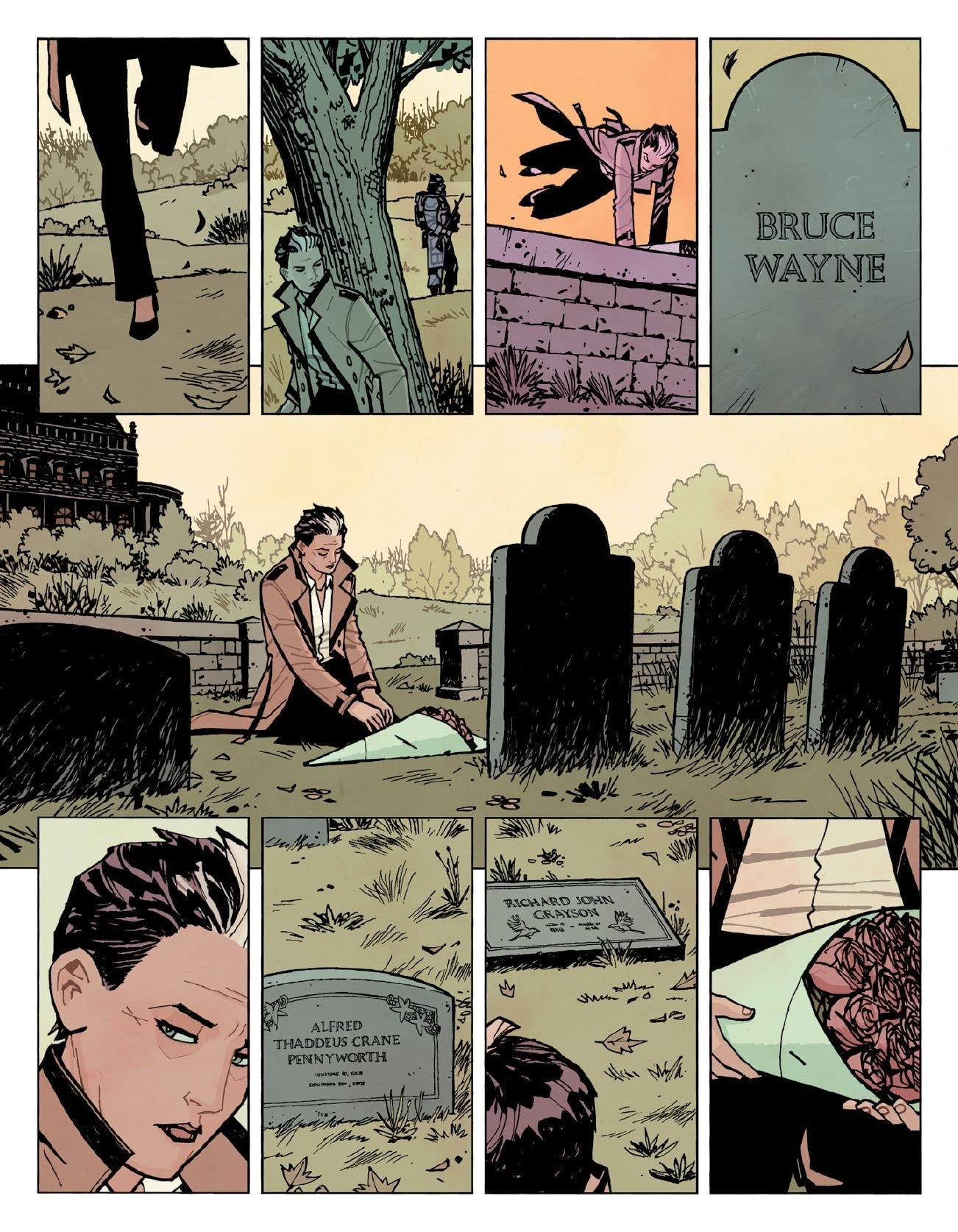
Here, a solemn moment where we find Selina sans costume—freshly released from prison—visiting the graves of friends long gone. Pensive, sure, and yet we can’t help but feel penned in by the number of panels in the top and bottom row, hardly any room to breathe there in the middle. To some degree, this is a goal of the narrative in this portion of the book, but it also undercuts any melancholy by giving us a lot to sift through.
(I want to take a moment to say that Cliff Chiang is one of my favorite artists working today and this book is absolutely worth picking up—it’s marvelous. Again, monthly comics from the Big Two, Marvel and DC, usually have a certain pace and energy that don’t always make quiet or still moments land the way smaller, character-driven comics do.)
More movement, before we look at why stillness is effective: In the following two panels from The Many Deaths of Laila Starr (poorly cropped by me, apologies), the way that artist Filipe Andrade erratically draws dancers at the party, their limbs and proportions twisted in libertine passion, portray anything but stillness, and to great effect:
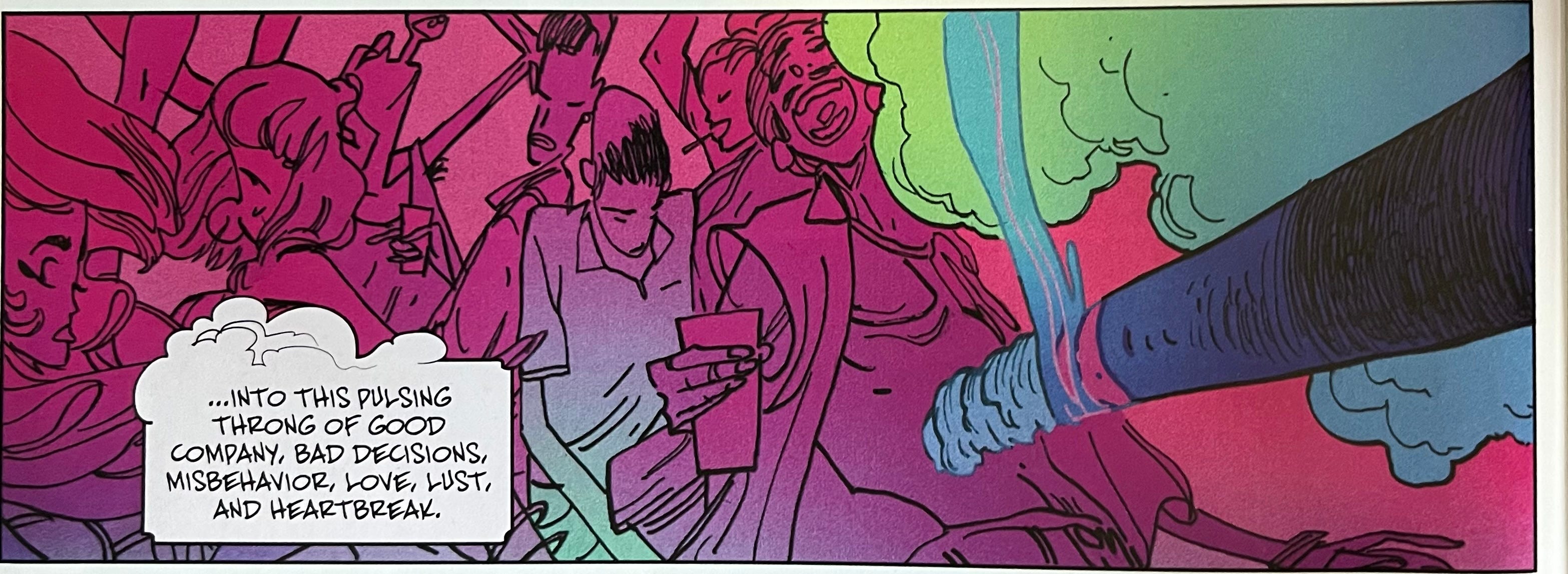
This is a story about reincarnated gods, the passage of time, many lives lived, so the vigor here makes sense. It’s overwhelming to look at, and you can feel it, nearly smell and taste it.
Compare these first two examples to Adrian Tomine’s work in his story “Killing and Dying” (from the eponymously-named collection):
He’s distant, the father, alone and cordoned off from his wife and daughter (which feeds directly into the themes of this piece), so we have minimal background details, a nominal amount of text, and repetition of imagery to help paint a certain kind of uncomfortable stillness. There’s action and movement here still, yes, but it’s nearly imperceptible compared to the previous examples.
Movement, as we see, does serve a purpose. So, why stillness, then?
Stillness allows for a moment of reflection and contemplation for the reader. In a medium that is often driven by movement and action, stillness can create contrast and emphasize key moments or moods. By using stillness, a comic creator can slow down the pacing of a story, drawing attention to specific details, expressions, or gestures that might otherwise be overlooked. This can be particularly effective in scenes that require a sense of tension or anticipation, allowing the reader to fully absorb the atmosphere of a moment.
Furthermore, stillness can be used to create a sense of pause or transition between scenes or story arcs, giving the reader time to process and reflect on what they have just experienced. It can also be used to convey a sense of introspection or inner turmoil within a character, emphasizing the emotional weight of a particular scene or sequence.
Read: Immersion.
Again, Gordan Hempton:
“Silence is like scouring sand. When you are quiet, the silence blows against your mind and etches away everything that is soft and unimportant.”
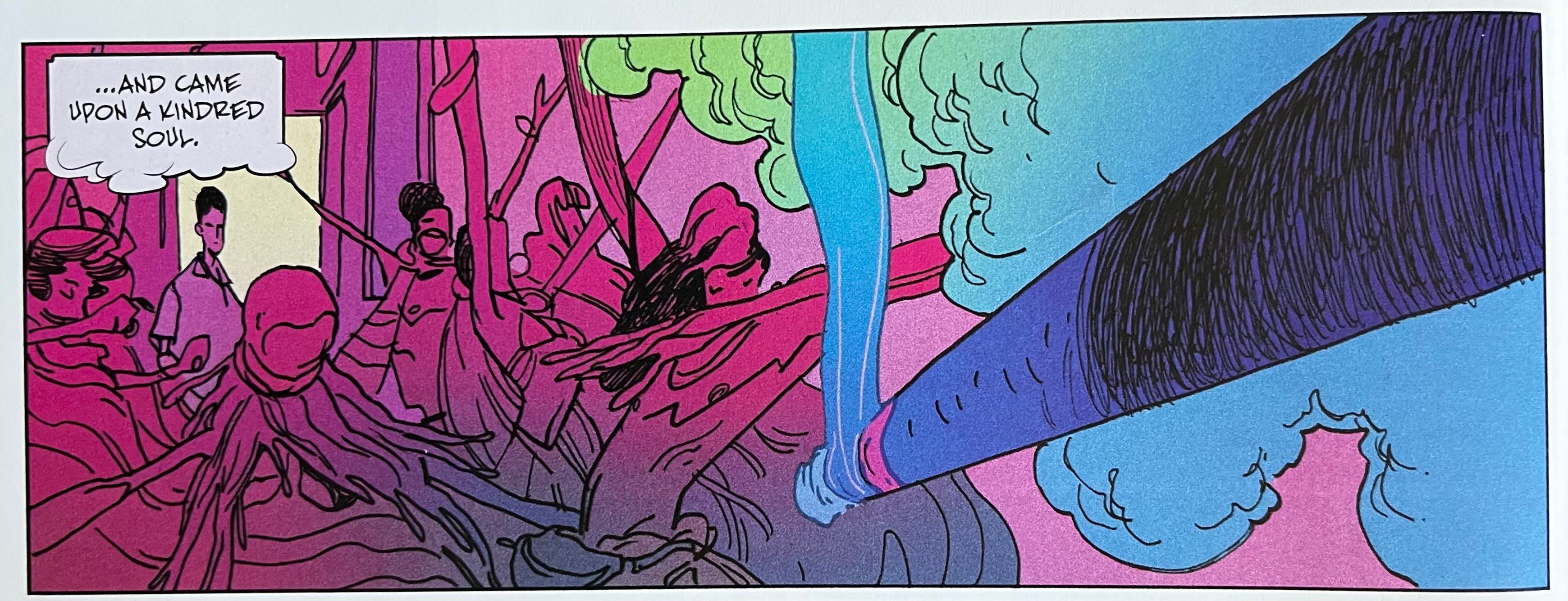
So how is stillness captured? It is often achieved through the use of negative space. Here’s a sample from a work in progress of mine.
The intent here is to show isolation, crushing loneliness, and toxic stagnation by the immense amount of negative pink space above, a general lack of details compared to the character and the restaurant in the bottom half. Robbit’s size also helps with the stillness through contrast of the big, heavy pink. But negative space alone cannot be the bearer of stillness and quiet; instead, it is our intent, what we present in our panels, how much of it, each tiny decision stacked on top of the other.
So it can also be a lack of dialog. (See: Black Hole by Charles Burns)
Or a muted color palette. (See: The Magic Fish by Trung Le Nguyen)

Or it can be a lack of background details that allows us to focus on a central character, their actions and expressions. (See: The Lost Women by Jamie Hernandez)

Regardless of how you decide to represent stillness, it comes down to intent and the grander narrative. Again, considering This One Summer, a favorite of mine, we are not meant to intone quiet in the following panels. We can imagine the sloshing of the waves, the warm breeze through wet hair, the lungfuls of air we take in.
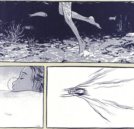
And yet, even with movement, we can argue this is a still series of panels—the lack of dialogue, the negative space, and the minimal color palette are all present; additionally, though, this is a portion of the story where Rose, confused about life, her parents, sex and romance and growing up, needs time alone, away from it all. We need the context of the story perhaps more than anything else to intone stillness here.
Again, quiet and still are not necessarily analogous. But these moments presented in our graphic work are important—for readers to rest, to allow them time to consider and be fully immersed in our narrative. We tell a story in graphic form because the medium allows what other forms cannot. In the same way we would take a nugget of an idea and turn it into a poem (emphasis on language, urgency and the ability to convey a single image or idea in a condensed form) over a short story (emphasis on plot, character development), we choose comics because of their ability to pull in a wider swathe of readers, to focus on small, visual moments to help tell a more nuanced story, and, I think, to allow for more contemplation and quiet through the use of multiple senses.

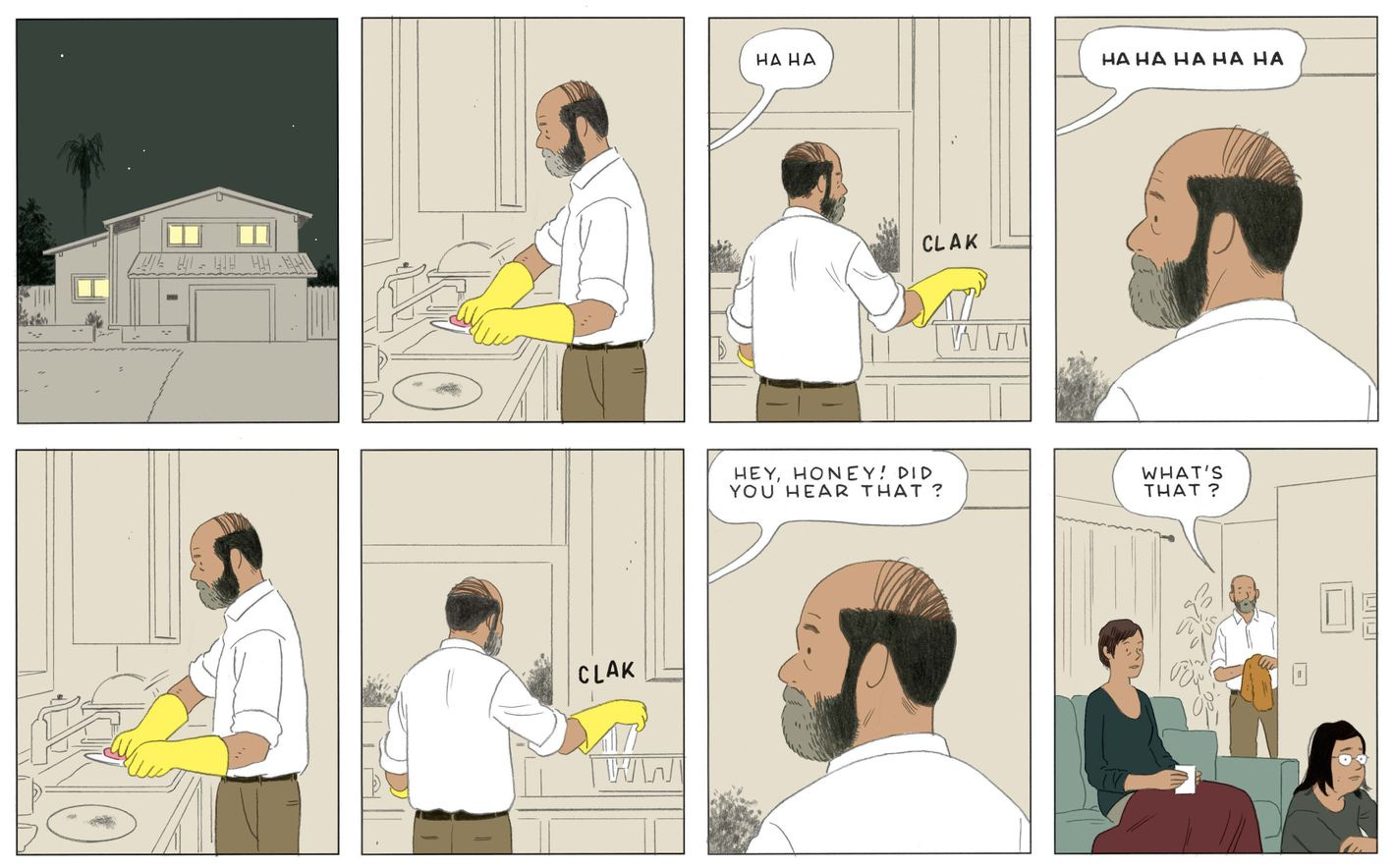
Create a four-panel comic that explores the ways in which stillness can be found in unexpected places. This could be inspired by a moment of calm in a busy train station or on a walk to the store, a moment of connection with a stranger, or a surprising encounter with nature.
How you decide to show stillness and quiet (like the examples we mentioned above) should be relevant to the story you’re telling. You may have busy, detailed panels that still show serenity in some way. Alternatively, you may present a severe lack of anything in order to tell your story. If possible, use personal experiences as fodder for this comic—I prefer the term “diary comic” but we can call this autofiction, memoir, or something in between. Pluck through your memories or daily habits and lean into something that may, at first, seem inconsequential. Use this as a starting point: Where is the stillness, and reflecting on it, what does it mean to you? What does it accomplish?
There is no wrong way to do this, friend. This is not about experience or how “good” you are. Comics and drawing and art is all subjective. Even with little practice or training, you can still create a fully realized and emotionally resonant piece. Not to oversimplify the process, but this really is just about adding lines and shapes on the page in a way that pleases you. That’s all this needs to be. Don’t hold yourself back dwelling on what you think you “can’t do.” This is you taking control of your own story. Delight in that.
Play and see what sticks. It’s very rarely the first version of something that hits the mark. If you like one aspect, scrap everything else and cling to the bits you’re excited about. Show it to no one or everyone. (Want to share with me? Please do! Tag me—I’m @Robhollywood on Twitter and Instagram—or email me: robertjamesrussell@gmail.com.)

What I’m reading:
Graphic: Wonder Woman: Dead Earth by Daniel Warren Johnson
Poetry: Soft Science by Franny Choi
Graphic: Maybe An Artist by Liz Montague
Graphic: “Expiration Dates” by Aubrey Hirsch (The Audacity)
Graphic: Do a Powerbomb by Daniel Warren Johnson
Graphic: “My First Motorcycle” by Ali Shapiro (The Offing)
Graphic: Cat Woman: Lonely City by Cliff Chiang
Novel: Infinite Country by Patricia Engel
A perfect panel:
The High Desert: Black. Punk. Nowhere. by James Spooner

The color I’m obsessed with right now:
hex #c7cfcd – “Tiara”

Beautiful things I’ve watched (and/or rewatched) recently and can’t stop thinking about:
Women Talking (2022)
Babylon (2022)
Stop Making Sense (1984)
Swarm (2023)
The Big Chill (1983)
Top Chef Season 20 (2023)
News:
I‘m thrilled to have my cover art on the latest issue of Great Plains Quarterly! This is my first-ever cover and I’m incredibly grateful to the GPQ team for giving me this opportunity.

A ways out, I know, but I’m excited to be teaching a FREE ONLINE workshop with the Sequential Artists Workshop (SAW) on Friday, September 8 at 7:00 PM EST. We will discuss drawing oneself as a non-human avatar, explore the reasons behind it, examine some examples together, and allow ample time for drawing. This workshop is open to ANYONE, regardless of their level of experience. Mark your calendars, and stay tuned for more information as the date approaches. ✌️
The LOW LIFE, LOW STAKES ART SALON (aka DRAW CLUB) is back! This Zoom-based drawing (and art) club is hosted Friday evenings, 7:00 PM Central. We chat, make art, and hang out for as long as folks want to. Want to join the fun? DM me on Twitter or Instagram or send an email (robertjamesrussell@gmail.com) and I’ll get you a link.

Great post, and thank you for the prompt. I had something in me I didn't know was there and that prompt just nudged it right into the paper.
So great to have your art on the cover of GPQ! :)