

How to Draw (Mood)
Crafting atmosphere and attitude, Andrei Tarkovsky, Lee Lai's Stone Fruit, hex #ed9093, and more.


Howdy, friend.
February is an odd month. Valentine’s Day splits the difference. Prior to that, it’s still very much winter here in Nebraska, cold whipping winds abound. End of the month, though? Warming sapphire skies, a promise of what’s to come in the spring. These blue skies are one of the things that made me fall in love—hard—with this place. In Michigan, where I’m from, there’s a foreboding mass of gray clouds that cover the entirety of the state from November through March. (Seasonal Affective Disorder is alive and well there, I assure you.)
I’m thinking of this, too, because in this, the second issue of the newsletter, I want to explore how we create mood on the page (during a month of very moody weather). How we draw and use lines and color and what we put in the panels—and what we omit—can help tell our story just as well as narrative text.
If this is your first time joining us in conversation at How to Draw, a hearty welcome. You can check out the archive of past posts here. I also have subscribe buttons throughout this post—please consider signing up so you don’t miss a single post. My goal with this newsletter is to create conversation. Not an artist or comics-maker? Totally fine. Maybe there’ll be something here you can pull into your writing, or at the very least, I hope you’ll consider revisiting comics as an artful, layered storytelling medium with new knowledge of what makes them so great.
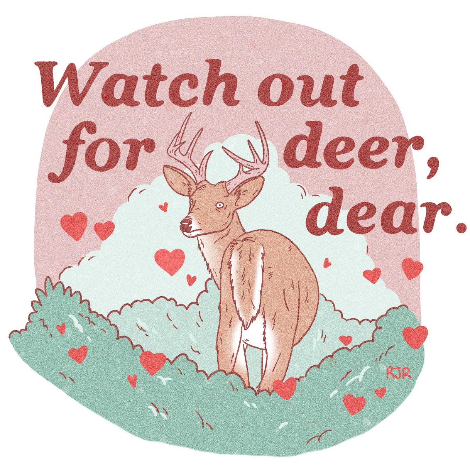
And, in honor of Valentine’s Day, as the lovelorn Midwest adage goes: Stay safe and watch out for deer. ♡
– RJR

“Poetry is an awareness of the world, a particular way of relating to reality.”
―Andrei Tarkovsky, Sculpting in Time
I studied film in college. I’ve always been obsessed with it as a storytelling medium. We had a TV in every room growing up. I had a small set next to my Sega Genesis in the basement. I was a sponge when I was a kid—I soaked up pop culture, movies and television shows and comic books and video games. I didn’t discover and obsess over writing until much later in my life. For the longest time, I wanted to be an animator at Disney. To me, there was a direct throughline between the things I was watching and what I could draw and shape on the page.
See, graphic work—memoir, novels, diary comics, etc.—have more to do with film than you might think.
First, though, I think we should define “mood.” In storytelling, mood is what the reader/audience feels while digesting the narrative. It shapes our overall impression of the work. In comics, it’s not just the color choice or brushstroke or some shading: it’s all of these things combined. To me, comics-making is also about a lack—what we leave out and why.
Questions to come back to when you’re creating:
What are we feeling right now—on a particular page, yes, but in a particular panel, too? And what should we be feeling?
For instance, I drew this pitiful-looking Robbit lying in bed.

I was going through some things when I drew this and wanted the panel to reflect my disposition. Instead of my typical color palette, I went with a straightforward visual identity here: white, a not-quite-black, nebulous-looking dark tone (hex #27343b, “Outer Space”), and instead of my black shading hues I used a disquieting blue (hex #ade0db, “Aqua Island”).
Here, it was important to not include any background details. I wanted clean lines, yes, but punctuated with a good amount of short, jagged accentuating marks to highlight the urgency of the feeling. It was a deliberate choice to not draw this image in black—with this shade, a very, very dark blue, you can almost see beyond the color fill, focusing on things that aren’t quite there. It helps build a sense of isolation; or, rather, it helps us feel like Robbit is both alone and simultaneously floating in a void. The expression on Robbit’s face is important, yes, but I’d argue the colors and lack of setting detail are doing the heavy lifting here.
Does this image sell this isolation and anxiety to you? What do you feel when you see it, even with no other context of a larger narrative?
Let’s hop back to film for a minute. I think a lot about the work of renowned filmmaker Andrei Tarkovsky. (Haven’t seen any of his work? Check out Stalker—which I’ll talk a bit about below—and Solaris, both of which are a must.)
Tarkovsky’s work is singular. He’s a master manipulator of mood, known for his visually stunning and thought-provoking films. Stalker (1979) is a science fiction allegory that tells the story of a mysterious and forbidden zone known as the "Zone." In the film, a man called the Stalker is hired by two men, a writer and a scientist, to lead them into the Zone, where it is rumored that a room exists that can grant a person's innermost desires. The film follows the journey of the three men as they navigate the strange and dangerous landscape of the Zone, grappling with both physical and metaphysical obstacles.
Consider this ethereal shot from the film:

One way Tarkovsky creates mood in Stalker is through his use of cinematography. He uses long takes, slow camera movements, and deep focus (where all elements of an image—foreground, middleground, and background—are all in sharp focus) to create a sense of stillness and contemplation. The film's visuals are characterized by a lack of vibrant colors, with muted greens, grays, and browns dominating the color palette. This contributes to the film's dream-like quality and enhances the sense of being in a world that is slightly out of step with reality.
Another shot from Stalker I particularly love:

Filmmaking and comics-making are both forms of storytelling and visual communication. Both mediums aim to bring the story to life, engage the audience, and convey emotions and ideas through images and words. Filmmaking uses cameras and shots and colors and actual movement. Comics-making uses these things, too, just varied slightly:
Panel Size and Arrangement: The size and arrangement of panels (the frames that outline images or scenes) can be used to control the pace of the narrative. Larger panels can be used to slow the pace of the story and emphasize a moment of importance, while smaller, more densely packed panels can be used to quicken the pace and create a sense of urgency. The arrangement of panels can also be used to create a sense of direction, movement, and flow in the narrative.
Framing and Angles: The way that the action is framed within each panel is crucial in affecting the mood of your work. The use of close-up shots of your characters, for example, can create a sense of intimacy, while the use of wide shots can create a sense of epic scale.
Color: The use of color, shading, and line can all be used to create a specific mood or atmosphere. For example, the use of dark, brooding colors can create a sense of dread or tension, while the use of bright, cheerful colors can create a sense of optimism and hope.
Line Quality: This refers to the thickness, texture, and style of the lines used to draw the characters and environments in a comic. Heavy and bold lines can create a sense of tension or drama, while lighter and softer lines can evoke a sense of calm or serenity. The use of lines with rough or jagged edges can convey a sense of chaos or action, while smooth and flowing lines can suggest grace and calm.
Word Balloons and Sound Effects: The use of word balloons and sound effects can also play a role in affecting the mood of a comic book. Sound effects can be used to emphasize the physical action taking place in a panel, creating a sense of excitement or drama, while word balloons can be used to convey dialogue and inner thoughts, creating a sense of intimacy or tension. You can also choose to include none of these things—a quiet, contemplative piece where the art does the storytelling itself.
At the most basic level, filmmaking and comics-making use sequential images to tell a story. I love thinking about this, reminding myself of what it is I’m doing on the page. Now, I don’t want to give the impression one must study film to be a good comics-maker, but I do think it helps to understand our chosen visual medium by understanding others.
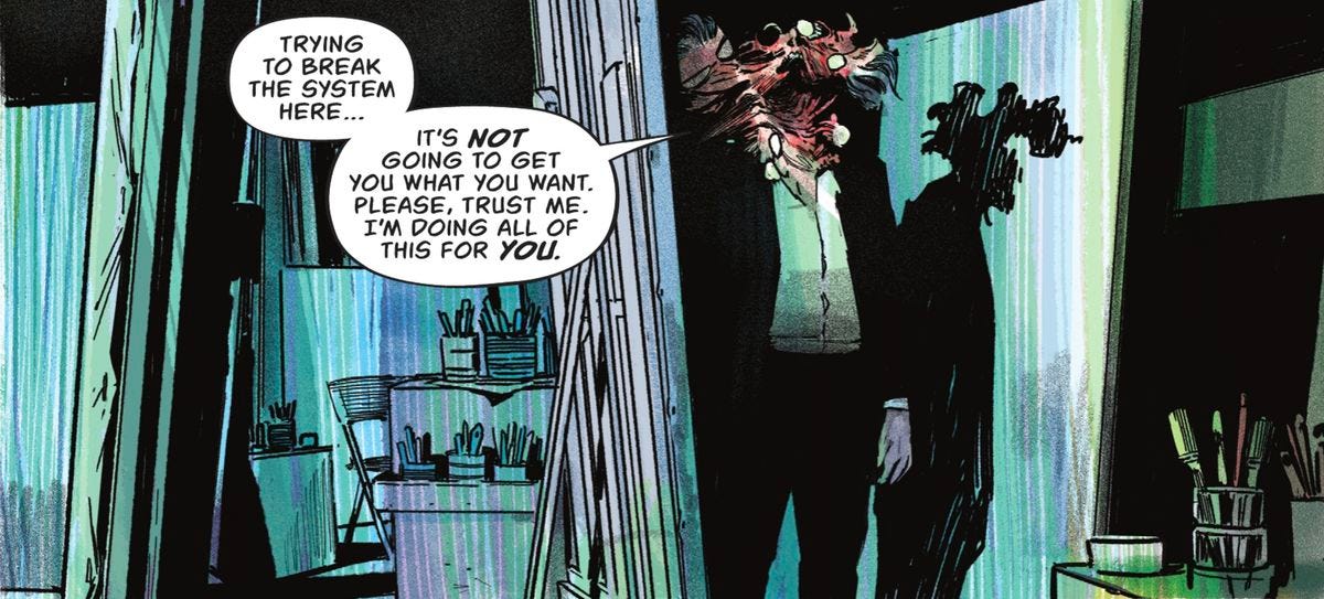
Let’s look now at Lee Lai’s sensationally-good Stone Fruit—a wrenching graphic novel about a queer couple, Bron and Ray, their love for Ray’s niece, Nessie, and how resentment can build between families and lovers and friends.
Here, a two-panel sequence that says more than it appears to:
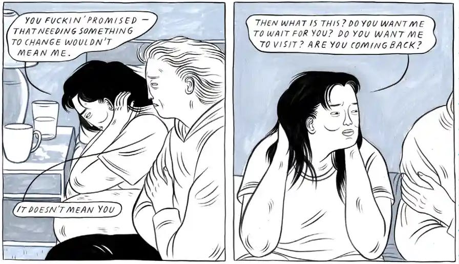
We read this as a sudden alienation and oncoming anxiety of the character, pushing her partner out of frame (while still being able to see only a sliver, knowing she’s there yet just off-screen). The use of clean black lines helps the characters stick out amid dreamy, paint-like backgrounds—further heightening these emotional swells.
In an interview with Hazlitt, Lee Lai discussed some of the motivations and goals of the story, the characters’ journeys:
They really love each other, and that’s not enough for them to figure out their problems and stay together. I’m also a big supporter of breakups. For the sake of growth and for the sake of people changing and thriving. Breakups can be really important. I wanted to show a breakup that isn’t about the relief of getting rid of someone. That people aren’t dispensable after the romance is gone but that sometimes, especially when people are bringing a lot of trauma to the table, things can’t work out in that way.
Another perfect panel sequence: When they’re together with Nessie, the world melts away. They become feral with play and creativity and hope (their faces change when they’re all three together; Nessie’s, in the panel below, is still changed, not wanting to go back to reality as it comes roaring back to them).
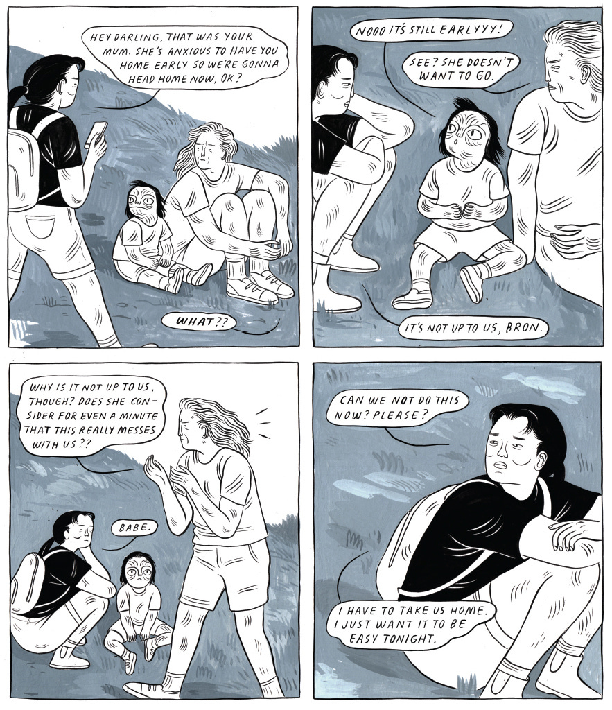
We can see and feel Lai’s intent in the panels as we progress: that resentment or anger or other negative emotions don’t automatically cancel out the need to be near someone. Proximity is critical to intimacy in this story. And we feel that, panel to panel, page to page.
A couple more stellar examples of comics that render mood exquisitely. Even if you’ve never read these books, before I give you my take, ask yourself: What strikes you? What do you feel, reading these samples?
Blankets, by Craig Thompson, is a semi-autobiographical graphic novel that tells the story of growing up in a conservative Christian household, focusing on the bond between two brothers.
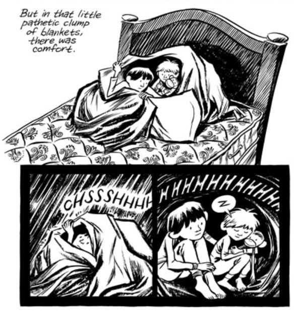
Thompson’s use of stark black and white color is an important choice: the use of black ink creates a sense of darkness and oppression, particularly in scenes depicting feelings of sadness, guilt, or isolation; the use of white and white space creates a sense of openness, lightness, and purity, often associated with moments of innocence, hope, and spiritual transcendence. The line quality is also worth taking note of: the fluidity and organic nature of his lines create a sense of warmth and comfort, while the more angular and fragmented lines used for moments of tension or distress add depth and nuance to the story. Additionally, the variation in line weight adds to the overall mood, with thinner lines creating a sense of vulnerability and heavier lines conveying strength and resilience.
Grass, by Keum Suk Gendry-Kim, is a historical biography that tells the story of a young Korean girl named Gil-son who is sold into sexual slavery during the Japanese occupation of Korea in the early 20th century.

Here, the stark, almost stubby linework and muted colors effectively convey the sense of oppression and hopelessness throughout the narrative. Gendry-Kim also makes effective use of light and shadow in the illustrations (and, as in the above illustration, empty space, when needed, to help intone isolation and anxiety). Then there’s the paneling and page design: close-ups and dramatic angles that further heighten the emotion.
In my opinion, these three graphic works are exemplary demonstrations of the comics/graphic medium. They showcase how small modifications to the creative elements can lead to significant impacts on the overall storytelling.
Again, Andrei Tarkovsky:
“Cinema in general always creates a possibility of putting pieces together into a whole. A film consists of all of the separate shots like a mosaic—of separate fragments of different color and texture. And it may be that each fragment on its own is—it would seem—of no significance. But within that whole it becomes an absolutely necessary element, it exists only within that whole.”
The same can be said for comics and graphic work, absolutely. Just remember to ask yourself as you create: What are we feeling right now—on a particular page, yes, but in a particular panel, too? And what should we be feeling?

Take a film that means something to you—something you find evocative—and create a three-panel series recreating a particular scene. Rewatch the movie a few times, first and during. Really try to understand what’s happening but most importantly how it’s happening. Don’t worry about the art itself, if that stresses you out. Focus on colors, the positioning of characters or objects, and what’s in view and what isn’t. Really understand how you can take a story in one visual medium and interpret it in another to the same effect.
Consider how you want to frame your elements. Will you use a close-up, a medium shot, or a wide shot—what do they do in the movie? How will you arrange your elements within the panel or panel sequence to create the desired mood or atmosphere?
Think about how you want to use color, shading, and line. Do you want heavy brushstrokes to help create a vibrant scene, or clean, sharp lines to show more detail? Consider the use of sound effects or word balloons to add an extra layer of mood, too.
There is no wrong way to do this, friend. This is not about experience or how “good” you are. Comics and drawing and art is all subjective. Even with little practice or training, you can still create a fully realized and emotionally resonant piece. Not to oversimplify the process, but this really is just about adding lines and shapes on the page in a way that pleases you. That’s all this needs to be. Don’t hold yourself back dwelling on what you think you “can’t do.” This is you taking control of your own story. Take delight in that.
Play and see what sticks. It’s very rarely the first version of something that hits the mark. If you like one aspect, scrap everything else and cling to the bits you’re excited about. Show it to no one or everyone. (Want to share with me? Please do! Tag me—I’m @Robhollywood on Twitter and Instagram—or email me: robertjamesrussell@gmail.com.)

I am deep in work on the first chapter of my graphic memoir, HARD BODY. It’s a fun process, the actual drawing, complicated by needing to decide on all the elements we talked about in this newsletter: What the shape of the story looks like on the page (panels, what I’m framing in them, overall movement). Right now I’m working off a script: I have the entire book written as a full-length essay-like narrative. I take the text that needs to be on the page and outline how each will look, how it makes sense to tell the story without hindering my narrative or message. Now, this first chapter is taking longer than I think later chapters will, as I try to get into a rhythm that works for me. I wish I could show parts of it off (alas, I cannot), but I’m so excited seeing how it’s coming together already. By the time I go to the AWP writing conference in March, the first chapter will be in the can. It’s surreal, but I can’t wait to celebrate that milestone.

What I’m reading:
Graphic: All-Star Superman by Grant Morrison and Frank Quitely and Jamie Grant
Graphic: Grass by Keum Suk Gendry-Kim
Graphic: It Won't Always Be Like This by Malaka Gharib
Graphic: The Nice House on the Lake (Vol. 1) by James Tynion IV and Álvaro Martínez Bueno
Nonfiction: Craft in the Real World by Matthew Salesses
Graphic: Heartbreak Soup by Gilbert Hernandez
Graphic: The High Desert: Black. Punk. Nowhere. by James Spooner
A perfect panel:
The Nice House on the Lake (Vol. 1)
What I’ve been listening to on repeat:
The Leftovers soundtrack by Max Richter
This Stupid World by Yo La Tengo
Sharecropper's Son by Robert Finley
“Killing Me Softly With His Song” by Robert Flack
“We’re In This Together” by Nine Inch Nails
Big Bend by Explosions in the Sky
The color I’m obsessed with right now:
hex #1e3239 – “Te Papa Green”

Beautiful things I’ve watched (and/or rewatched) recently and can’t stop thinking about:
Under the Skin (2013)
Season 4 of Atlanta (2022)
No Straight Lines: The Rise of Queer Comics (2021)
The Menu (2022)
Decision to Leave (2022)
News:
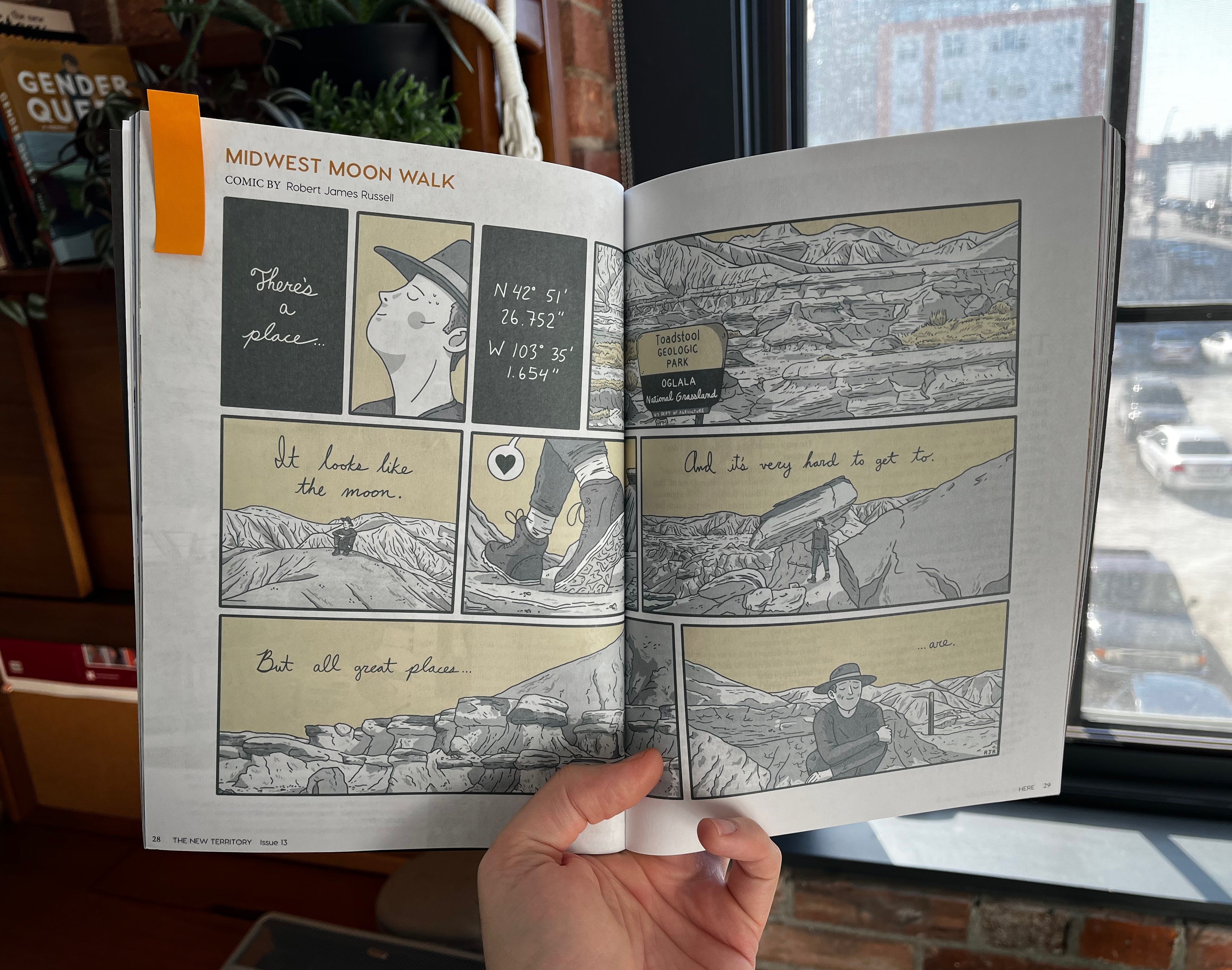
I have a comic called “Midwest Moonwalk” in Issue 13 of The New Territory, a gorgeous, bi-annual magazine of the Lower Midwest (featuring journalism, literature, photography, and art). Can’t recommend the issue enough. Pick up a copy here.
I’ll be at AWP 2023 in Seattle this March 8 - 11. In addition to wandering around the bookfair in a happy daze, I’ll be on a panel called “Beyond the ‘Me’ in Memoir: Working with Research, Imagery, and Hybrid Forms” along with Kelcey Ervick, Eleni Sikelianos, Deborah Miranda, and Tom Hart. Details below. Stop by if you’re so inclined!
Day: Saturday, March 11, 2023
Time: 9:00 AM—10:15 AM
Room: Room 337, Summit Building, Seattle Convention Center, Level 3
The LOW LIFE, LOW STAKES ART SALON is back! Started in 2022 by author Aaron Burch and me, this Zoom-based drawing (and art) club is hosted Friday evenings, 7:00 PM Central. We chat, make art, and hang out for as long as folks want to. Want to join the fun? DM me on Twitter or Instagram or send an email (robertjamesrussell@gmail.com) and I’ll get you a link.
My GOONIES art prints are here! The Goonies is one of my all-time favorite movies, so I decided to make a limited-edition 8x10 print celebrating one of its most iconic scenes. These very limited-run prints are signed and numbered on gorgeous cardstock. As of writing this newsletter, there are only a few left—if you’re interested, send me a message!


Did the assignment! https://www.instagram.com/p/Cp5me4dvHeQ/