


How to Draw (Linework)
What our linework reveals about us and how Tintin and manga shaped my art style. Plus: Emil Ferris' My Favorite Thing Is Monsters, Sailor Moon, hex #F8F2F7, and more.

Howdy, friend.
I’ll keep this introduction brief since this month’s newsletter is a bit on the long side. As I write this, with winter storms relentlessly pounding us here in Lincoln, Nebraska, and the promise of spring (somewhere) on the horizon, I’ve been inspired to ask myself: Why these decisions in my art? Why this style? It’s good to periodically revisit these questions—to strip things down to the studs and see where improvement can be made.
No matter how much I question my choices, I always return to the same foundation: linework, the building block of comics-making.
In this month’s newsletter, my goal is to (briefly) trace a history of linework and unpack the significance of the marks we make on our pages. After all, every comic—every illustration—starts with a line. It’s this simple idea, and the following questions, that shaped this month’s focus: How do changes in our strokes transform the meaning of our work? How do the lines we draw—and the details we choose to include or leave out—shape the narratives we create?
If this is your first time visiting How to Draw, a hearty welcome. You can check out our archive here. And if you haven’t already, please consider subscribing so you don’t miss a thing.
Stay safe out there. ♡
– RJR

How you style your work—and the search for that style—is a major part of the comicsmaker’s journey. Black and white or full color? A limited palette or something loud and chaotic? Do you keep your linework loose and sketchy, or crisp and controlled? Are your characters exaggerated, elastic, or carefully proportioned and grounded in realism? Do you lean into dense, detailed backgrounds, or let negative space do the heavy lifting? Every choice shapes not just the look of your work, but how readers experience it—how they feel it.
But this conversation about who we are on the page begins much earlier: What kind of line do you use, and what does it say about your story at its most fundamental level?
Let’s back up.
Doodling, drawing, comicsmaking—it all begins with a line. A single mark. A promise of what’s to come.
Consider the cave paintings of Lascaux, estimated to be between 17,000 and 22,000 years old. Even in these ancient images, a stampede of horses and oxen is clearly outlined, visualized, and understood. The line carries meaning, motion, and intent.

Or take Piet Mondrian's later work, such as his 1921 piece Composition with Large Red Plane, Yellow, Black, Grey and Blue, an abstraction where Mondrian sought a more mystical experience through the precise intersection of horizontal and vertical axes.

As comicsmakers, each of us develops our own style, making every comic unique; the art shapes the story just as much as the story shapes the art—the two are inseparable. But at its core, it all starts with a simple choice: how we make our lines.
Scott McCloud, in his seminal Understanding Comics, explores how lines themselves can act as metaphor:

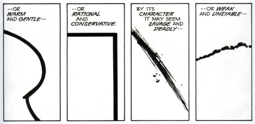
In writing, every word has a purpose—driving the narrative forward, deepening character growth, shaping the world, etc. In comics, this is even more crucial. With limited space, it’s not just every word that matters, but every mark on the page. Every stroke, every shadow, every detail carries weight.

Take Emil Ferris’ My Favorite Thing Is Monsters: the artwork mimics a child’s notebook sketches, with ballpoint pen-like cross-hatching that gives it a raw, deeply personal feel—one that blurs the line between story and the character’s own act of creation.
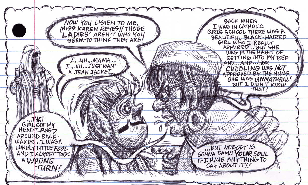
Would this (incredible) graphic novel work with “clean” lines? Probably. However, part of its impact comes from how every aspect of the art contributes to the overall emotional experience. Namely: This “drawn” style is a part of the narrative itself.
This One Summer by Mariko and Jillian Tamaki—one of my favorites I’ve prattled on about previously—is the story of two girls navigating adolescence at a shared lake retreat, brought to life with loose linework and a limited color palette, helping to convey the dreamlike, nostalgia-laden atmosphere that permeates the book.
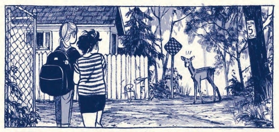
You’ll also notice that while some details are crisp and clear, the background becomes more abstract (read: fewer lines; more color blocking shapes). This helps convey the sense of memory—the place is vivid but fading at the edges.
Similarly, Daytripper by Fábio Moon and Gabriel Bá uses varying line weights, dreamlike watercolor (with minimal/soft lines in the deep background), and fluid panel transitions to explore different versions of the protagonist’s life. The shifting visual style blurs the boundary between memory and reality, reinforcing the story’s meditation on fate, choice, and the fleeting nature of existence.
When I started experimenting with who I was on the page, I found myself drawn to the Tintin comics I loved as a kid. I admired the clean lines, how everything was outlined in a recognizable way—the way every stroke carried the same weight. This style invites you to linger, to take in every nook and detail.
Turns out, Tintin’s creator, Hergé, pioneered this approach, later known as ligne claire, or “clear line.” This style minimizes hatching (if used at all), downplays contrast, and often juxtaposes cartoonish characters against realistic backgrounds.
Take a look at these panels from The Black Island, where contrast is almost nonexistent, and each shape is precisely defined by a clear line:

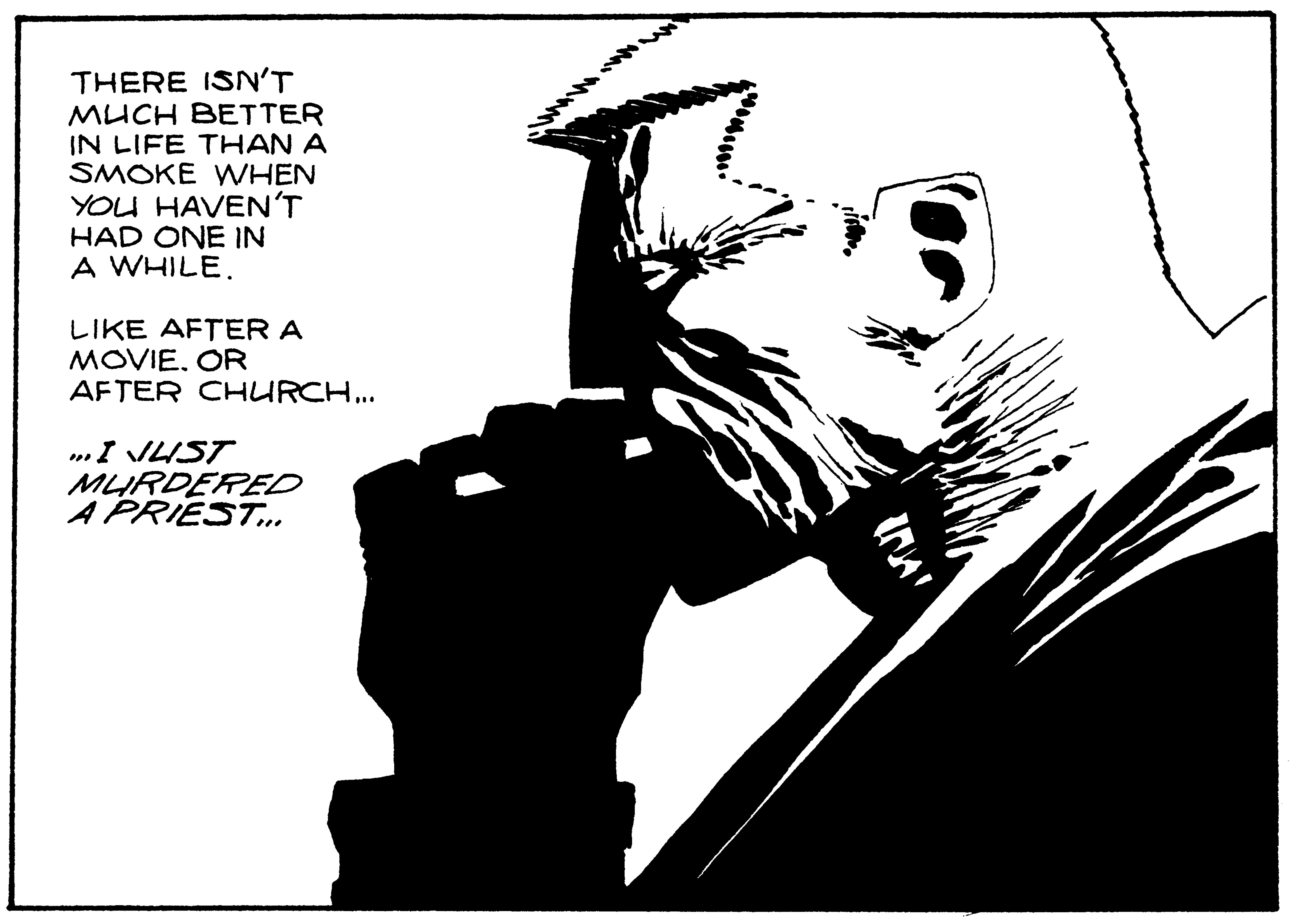
Contrast this work with a panel from Frank Miller’s Sin City, a comic that is sculpted from shadows.
Style typically develops organically as we refine our craft. Some artists embrace abstraction, others lean into precision, each choice shaping how their stories unfold. For me, there was a clear throughline between these Tintin books and the Japanese manga I rediscovered in my twenties.
But first, let’s revisit Scott McCloud and a famous panel from Understanding Comics that explores universality in character design.

In much of manga—and Tintin, too—characters, especially the heroes, are drawn with minimal detail (or, again, clean lines), their faces left almost devoid of unique features. Meanwhile, the backgrounds are rich with intricate details. Why? These characters easily become proxies for the reader, alllowing a deeper connection to the story.
Let’s look at the cityscapes in Ashita no Joe versus the design of its titular hero:

Or, similarly, Naoko Takeuchi’s Sailor Moon:

And a personal favorite—this famous panel from Junji Ito’s Uzumaki. The grotesque transformation of Mr. Saito is packed with intricate details, his body warping into the shape of a spiral. Yet, in the foreground, the minimalism of the other characters’ facial designs allows us, once again, to step into their place and feel their abject fear.

There’s something almost freeing about using a ligne claire approach.
It takes a decision off my plate: instead of weighing which lines should be dynamic or thickened in a given moment, a clear, uniform line lets me focus on the details and narrative in two key ways:
Simplified character designs heighten expressiveness, making it easier to animate emotions from panel to panel.
Detailed backgrounds establish mood, enhancing storytelling without overshadowing the characters and providing necessary context.
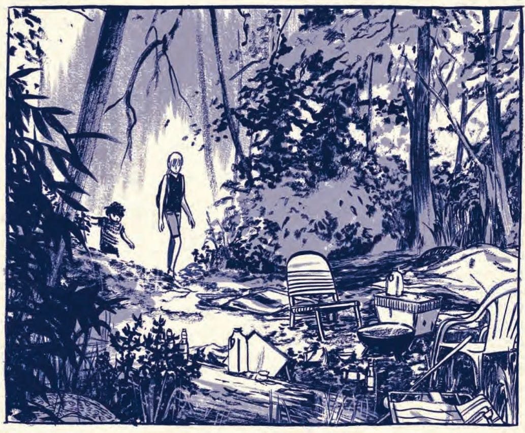
Yet, depending on the project, I may alter my style from time to time to fit the narrative. Take, for example, a recent comic I published about the sudden death of my sister and processing my thoughts on grief.

Inspired by My Favorite Thing Is Monsters, I chose a looser, marker-colored style to reflect both my processing of my sister’s passing and the rushed, chaotic feel of a journal entry. Rather than clean lines, I used a digital brush that mimicked a scraggly, over-inky pen.
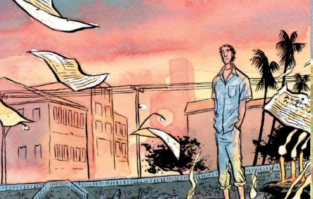
I used similar linework in my comic “Soft Eyes,” published by The Florida Review, where I explore the nature of pets and what we gain from having animals in our lives. The linework and limited color palette were key in creating a reflective vibe.

Still, in these examples, the hallmarks of my style—unmistakably influenced by Tintin and various manga stories—remain evident: detailed backgrounds, simple, cartoonish faces/characters, and low contrast that allows every detail of the art to shine through.
As I look ahead, I’m unsure how my style will continue to evolve, but one thing is clear: There’s no right way to exist on the page—only the need to be intentional with every stroke.

What I’m reading:
Nonfiction: H Is for Hope: Climate Change from A to Z by Elizabeth Kolbert
Poetry: Bluff by Danez Smith
Graphic: Heat by Jean Wei
Graphic: Indigenous Peoples’ History of the United States: A Graphic Interpretation by Paul Peart-Smith and Roxanne Dunbar-Ortiz
Graphic: My Body Unspooling by Leo Fox
Graphic: Soft by Jane Mai
A perfect panel:
Heat by Jean Wei

The color I’m obsessed with right now:
hex #F8F2F7 – “Prim”


I love this article. And it’s made me think about the connection between Tintin and the early Warner Bros. cartoons. Of course animation necessitates simplifying characters which need to be drawn more to simulate movement. Backgrounds can be far more detailed there.