


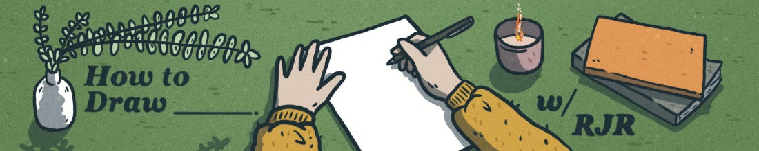
How to Draw (a Cover)
My process of illustrating a cover! Plus: Finding inspiration in western Nebraska, Adrian Tomine, hex #4A8CA2, and more.

Howdy, friend.
July! How is it already July? For whatever reason, even though Summer is far from my favorite season—Fall rules—I find my creativity skyrocketing along with the heat and humidity. Something about these long, hot days rattles my brain, and I see ideas in everything around me.
This month, amidst a flurry of smaller illustrative projects, I'm excited to showcase my artistic process. Recently, I pitched a design for the cover of an upcoming issue of Great Plains Quarterly, an esteemed academic journal founded in 1981 that publishes interdisciplinary research, photography, and creative writing about the history, culture, and environment of the Great Plains region. They liked my proposal, so I've been immersed in bringing it to life. Designing covers is a departure from sequential comic work, presenting unique challenges and rewards. So, here’s a behind-the-scenes look at how the cover came to be.
If this is your first time visiting How to Draw, a hearty welcome. You can check out our archive of posts here. And if you haven’t already, please consider subscribing so you don’t miss a thing.
It’s muggy out there—stay hydrated or, better yet, indoors! ♡
– RJR

#1 - The Idea
In 2022 I was lucky enough to do my first cover design for Great Plains Quarterly. I had no restrictions and decided to do six portraits of cowboys of color to help change the narrative of who, contrary to popular belief, is actually in Nebraska.
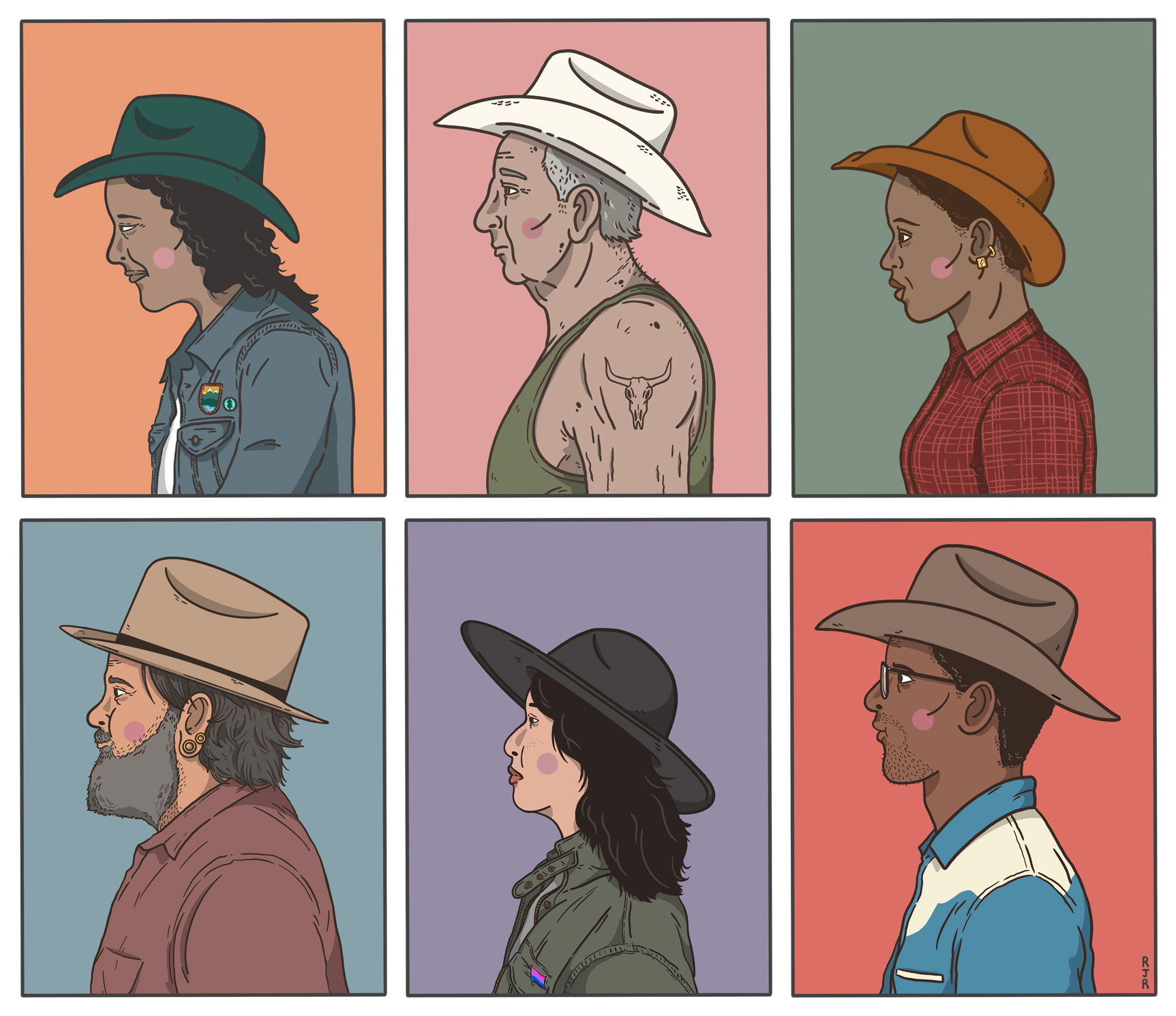
Here’s what the final cover looked like:

In an interview with Faber, legendary cartoonist Adrian Tomine had this to say when discussing what went into working on his first New Yorker cover:
With most illustrations, you don’t have to worry too much about what you’re going to draw. You’re usually told what the subject should be, and you have to make some choices about composition or color or things like that. But with a New Yorker cover, even if you have a starting point like “books,” you still need to basically invent an image out of nothing
Indeed, given their excitement over my first cover, the editors of Great Plains Quarterly were open to pitches for another; however, this meant I needed to figure out my starting point. And covers are tricky: There should be a narrative, however small, to help set the tone for what’s inside.
Like Adrian, the only direction I had for this new cover was: Make it fit…broadly.
Okay, so since this is a journal all about the Great Plains, I began thinking about my home in Nebraska, all I know about the region. Like how, especially in western Nebraska, it’s common to see folks riding horses straight into town and through neighborhoods—places wouldn’t expect a horse to be. No matter how often I see it, it fills me with wonder. Like I’m suddenly back in time.
Once, I saw a cowboy on a horse trotting down the main street of Scottsbluff, a small town near the Nebraska-Wyoming border. In one hand the cowboy was holding the reins; in the other, a bag of fast food. The horse was nonplussed; it might as well have been out in some tall grass somewhere. The image stuck with me.
I was onto something: Nebraska is all about the intersection of rural and urban. Folks come into the cities of Lincoln and Omaha on the weekend flush with caked-on cowboy boots and dusty hats looking for some big-city adventure. Drive for ten minutes out of either city and you’re suddenly in the sticks, surrounded by nothing but rows and rows of corn.
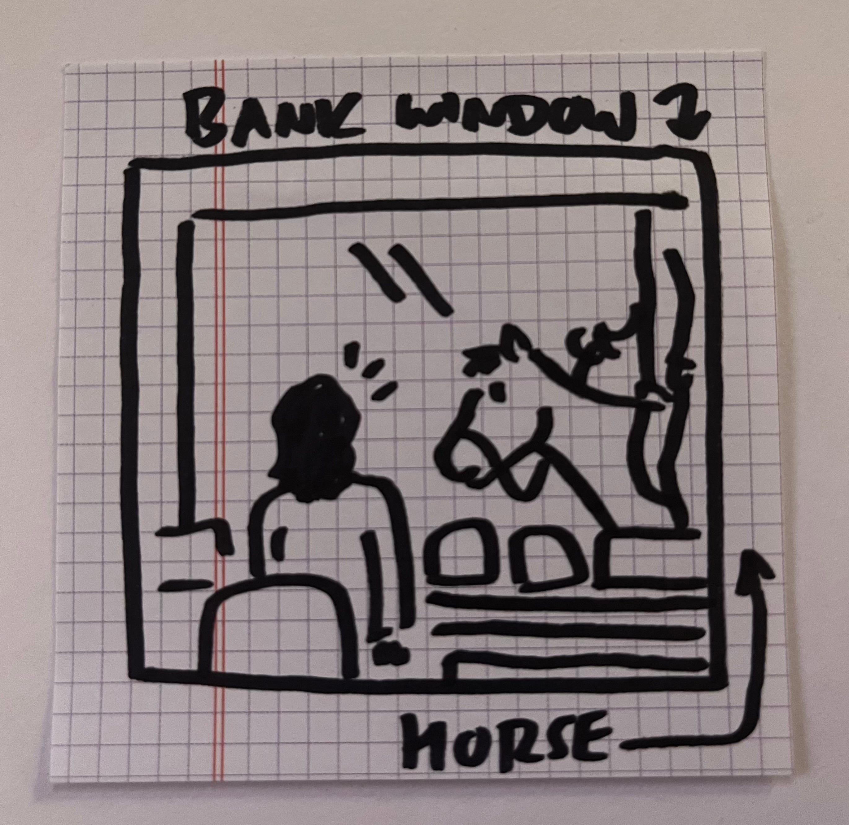
I don’t know how I landed on it—a concoction of my memories plus stories I’d heard, I suppose—but after working out some very rough sketches, I landed on an idea I was excited about and that told some kind of story.
Here’s my original doodle, drawn hastily as it came to me: a horse and rider going through a bank drive-thru. Sometimes all it takes is a black marker and a blank piece of paper, however crude the sketch is, to bring an idea to life.
#2 - The Drafts
Some illustrations take lots of twists and turns, starting as one thing and ending as another. For this one, once I had pen on paper, I knew this was the idea to see through.
The next step, then, was to have a cleaner, more polished first draft so I could more clearly see what the story and layout would be before I began firming things up.

When working on covers, I’m drawn to the narrative: However small, what is the story happening on the page? I also want to see a lived-in quality, as well as some movement. That this drawing is merely a snapshot of a place and that, a moment later, things just keep on going.
While I liked this initial rough draft, something kept nagging at me: with the bank teller’s back to us, and unable to see her face, she became less a part of the narrative which takes us out of it.
So, I went back and played with the idea, ultimately landing on a 3/4 view from behind.

Now we see more of her face, how her hair is pulled back, hands on hips as if to amplify her confusion and/or annoyance, however you read into it.
As far as the lived-in quality, a University of Nebraska jacket slung over the chair, a bobblehead of the university’s mascot, Herbie Husker, and some stray envelopes and bank tech help the scene feel full.
From here it was time to move to the secondary characters, the horseback rider and the man in the car. While the car itself wasn’t in my initial sketch, it was important for us to see a full expression aimed at the startling scene. While someone riding a horse may be commonplace in parts of the country, to many of us this would be a sight to behold—and seeing at least one amazed face helps put us into the piece.

At this point, I still needed to sort out the background, but I decided to figure that out while working on colors. I was pretty excited about how this was turning out: there was a narrative, a nice idea of movement, and a clear notion of place.
#3 - Colors & Finals
First, I wanted to firm up the background. In my original sketch I had a series of abstract trees/bushes, but as I was reworking things, I didn’t think this quite felt like Nebraska. Instead, I decided to block in tracts of grass with a limited color palette. Also, at this stage, I played around with the colors of the horse a lot before finally settling on a chestnut bay. I built the color palette around these two elements.

The blues, grays, and beiges all work nicely together in creating a soft-looking image that focuses our attention on the blues, pinks, and reds. During the coloring phase, I also softened the background outline color from black to dark gray to help partition out the foreground and background and create the idea that you're looking through glass.
Finally, as is my style, I added shadows for depth and to help pull our attention to the focus of the piece, the rider on the horse.

This is the finished cover design, which will be published in the late summer of 2024. It takes a very different kind of energy to work on covers, but I find the process to be exhilarating: To carve out a narrative, to make something memorable, and, in this instance, to make something quintessentially Nebraska is a unique confluence of creative forces.
What I’m reading:
Graphic: “I’m Pregnant. I’m Traveling. I’m Terrified.” by Aubrey Hirsch (Vox)
Graphic: “Recovery and Decline: True Stories from the ICU” written by Ernesto Barbieri and illustrated by Jess Ruliffson (Boston Globe)
Graphic: Delicious in Dungeon, Vol. 1 by Ryoko Kui
Graphic: You and a Bike and a Road by Eleanor Davis
Poetry: Irregular Heartbeats at the Park West by Russell Brakefield
Novel: Like Happiness by Ursula Villarreal-Moura
What I’m watching:
I recently discovered the short animated film Northened by animator/illustrator Una Di Gallo, about two teens growing up in the industrial heart of Hamilton, Ontario. It’s stylish and wonderfully strange and the art is just magnificent. I embedded the trailer below. Watch the full thing on YouTube.
A perfect panel:
Rolling Blackouts: Dispatches from Turkey, Syria, and Iraq by Sarah Glidden
The color I’m obsessed with right now:
hex #4A8CA2 – “Wedgewood”

Your cover is so lovely! Thanks for sharing your process— I love seeing how work evolves