


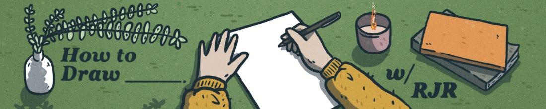
How to Draw (a Book)
How I craft a page, from script to final colors. Plus: Adrian Tomine's process for making a New Yorker cover, Camille Jourdy, hex #545F73, and more.

Howdy, friend.
I going to do something a bit different this month. I’ve had quite a few people ask about my process—drafting and drawing and layouts, etc.—so I thought it would be fun to break down a page from my graphic memoir Hard Body, from conception to final inks/colors.
Fall is in full swing here in Nebraska—I’ve just pulled my sweaters and long coats out of storage. Something about the cold weather, being bundled up in coffee shops, the musky-sweet smell of fallen leaves…I feel creatively alive this time of year. And I feel it inspiring my work, too: Give me a desk by a large window with a view of the world and I am set. At any rate, I hope you enjoy a peek into my process. If you want to share yours, or if you have any questions about mine, I’d be more than happy to continue the conversation.
If this is your first time visiting How to Draw, a hearty welcome. You can check out our archive of posts here. And if you haven’t already, please consider subscribing so you don’t miss a thing.
Stay warm and safe out there, friend. ♡
– RJR

“In comics at its best, words and pictures are like partners in a dance and each one takes turns leading.”
—Scott McCloud
“The director has only to choose the moments he will capture and to construct a whole out of them.”
—Andrei Tarkovsky
I’m fond of saying that there’s a great similarity between comicsmaking and filmmaking. Our panels are the shots. We, the illustrators, are the directors, deciding what to show, deciding how panels flow from one to the next. Do we want a close-up of our protagonist to show their fear? Or maybe a wide, establishing shot to remind the reader of the greater world our character finds themselves in? We have that level of control.
I’m going to focus on a page from Chapter 1 of my graphic memoir, Hard Body, and how I get from concept to final ink/colors. (I’m mostly working on this book digitally, but I still use the terminology “inks/colors” to mean the final product.)
The script is done by this point, and I’ve parceled out what will appear on each page. Before anything tangible happens, I first do a lot of thinking. What came before? What comes after? What are the themes of this chapter/page/section? What am I trying to get the reader to feel here?
I sit and stew on these ideas until a kernel of something is formed, a smoldering coal buried in the ash I begin to dig out. From here, I start with a rough sketch of what I think the page might look like. The goal here, primarily, is to puzzle out the flow and make sure there’s cohesion and clarity.
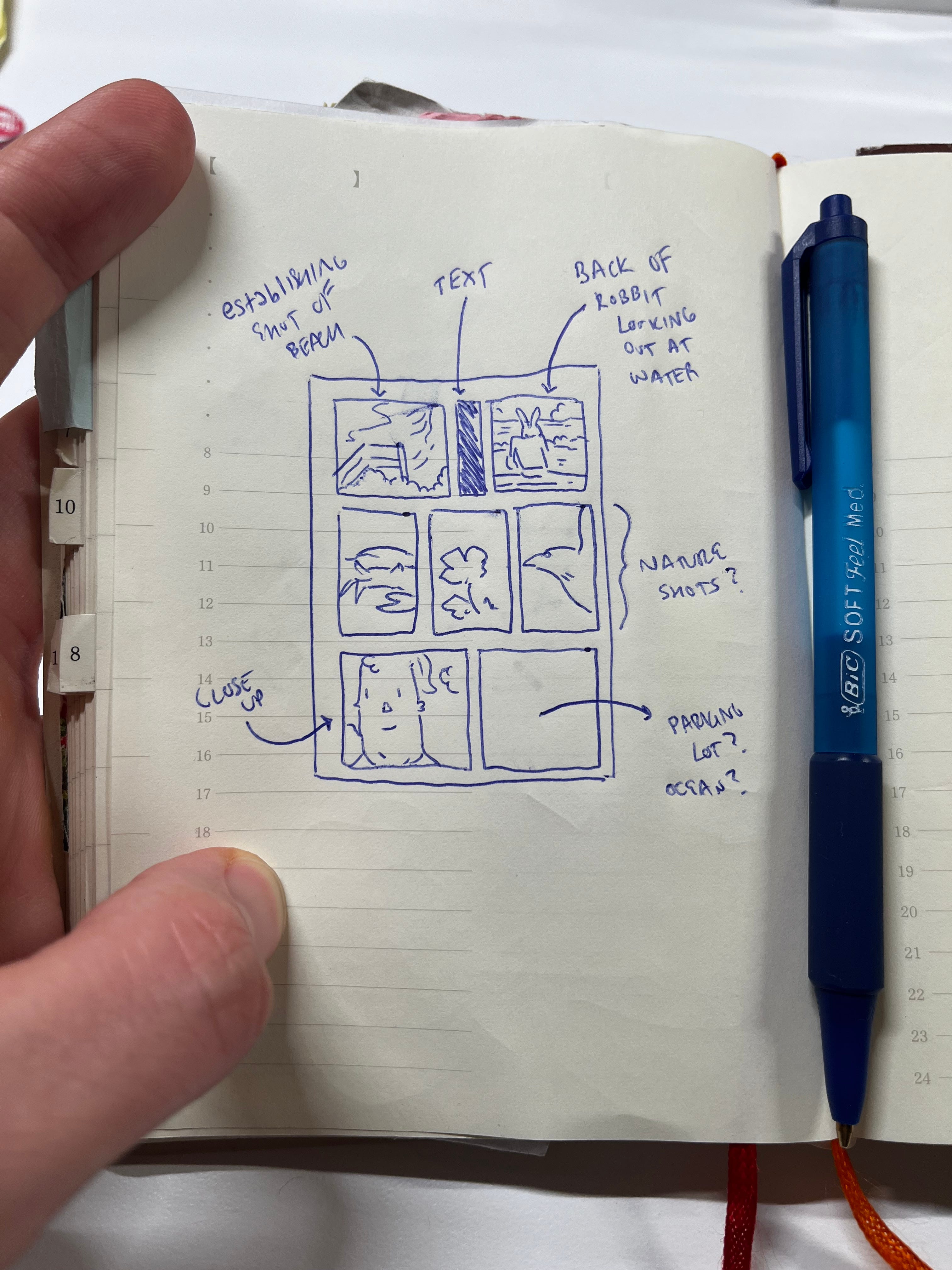
After the rough sketch, I’ll make a digital sketch in Procreate, a program I use for 99% of my illustration/comics work. Here, I’ll redraft ideas from the sketch with more details but also with notes in the margins: What may be working, what I’m already sensing is not, etc.

This particular page in my book is about me leaning into exploring the natural world as a way to combat my body dysmorphia, specifically when I was living in Los Angeles. I know I want an establishing shot of a beach I used to frequent, which also shows how small I am in the grand scheme of things and how much wonder that whips up in me—a frequent theme in my work.
While drafting this page, I already started questioning some of these initial decisions. I liked the middle panels showing flora and fauna—these would be a nice, poetic juxtaposition with the text I was planning. But the first panel was starting to feel claustrophobic. I wasn’t getting the sense of grandeur I was hoping to achieve. I also didn’t like how it butted up against the all-black text box to its right, which seemed now like some sort of wall.
For the end of the page, I had this initial idea of showing a parking lot, but it was starting to feel too inorganic compared to the natural world I was presenting. This, too, seemed to arrest and confuse the narrative—there was no reason it should be there.
Overall, the flow of the page wasn’t working. Again, thematically, I’m trying to show how feeling small out in the natural world, amongst mountains and the ocean, helped me cope with depression and body dysmorphia. Feeling small in these spaces helped me put things in perspective in a very healing way. This page was beginning to feel crowded, antithetical to what I was trying to achieve.
So, onto the next draft.

In my fussing, I decided to move things around. Embiggen the first panel/establishing shot so we could feel the magnificence of this place. Move the shot of me on a picnic table towards the end of the page followed by a close-up of my smiling Robbit face. Yes, the flow was working now: Set up this space in a big first panel, show various flora/fauna to accentuate the script, ending on my face as if it had been my point-of-view this whole time, watching the water, the wildflowers, the sea life, the birds.
I started adding black boxes to indicate where the narrative text would go. This also allowed me to see which parts of the art would be covered, and how I might account for this as I finalized things.
Overall, I was pretty happy with how this was turning out. So it was on to finalizing things, adding more details, colors, and shadows.
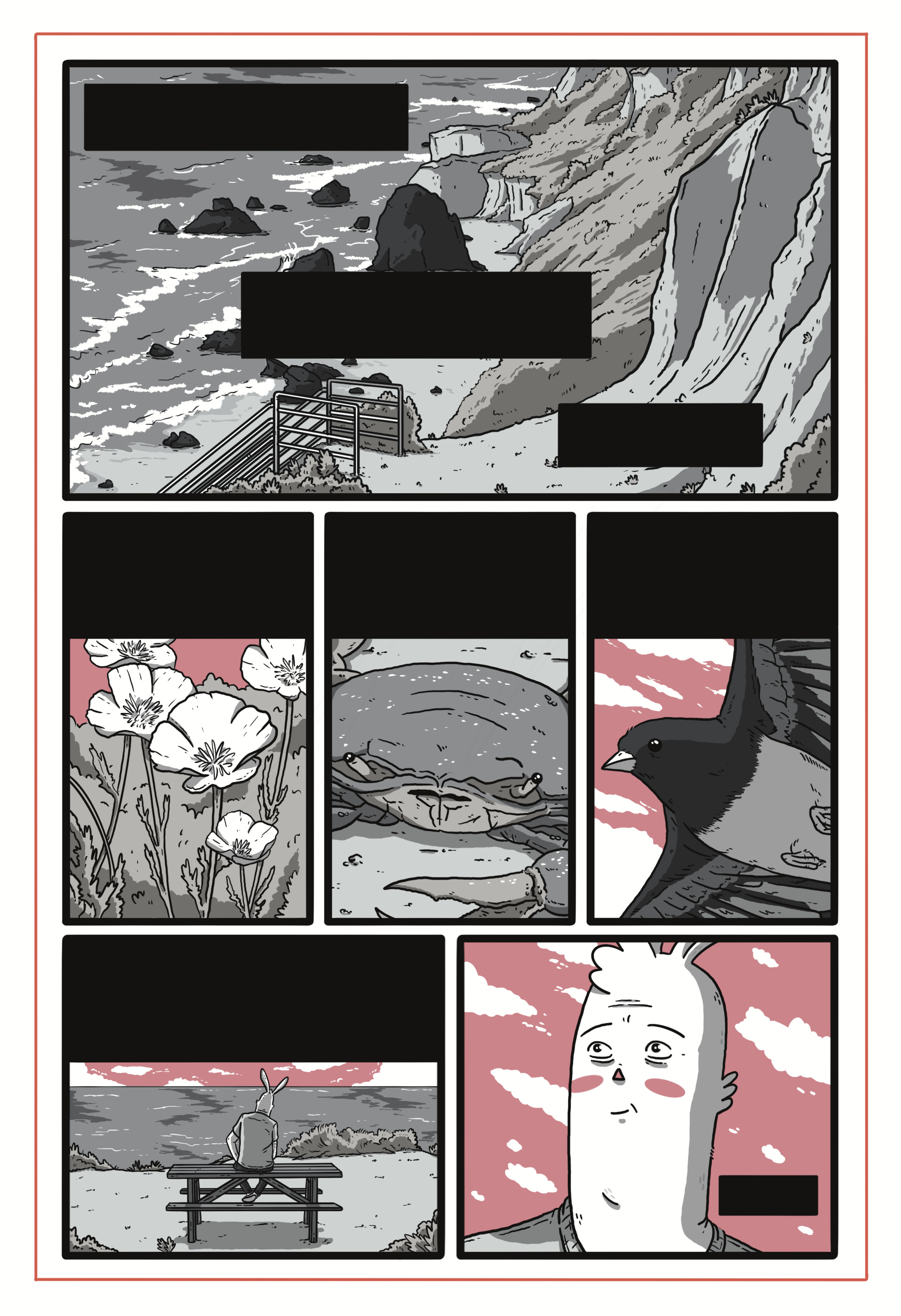
I’ve omitted the text as I’m still working on the book, but left the text boxes to show where things ended up. Now, this page is doing exactly what I need it to: text and image are aligned, working in tandem instead of against each other. There’s a flow to the end. Everything here has a purpose.
If you’re like me, and you love seeing artists show their process, Adrian Tomine detailed his process making a cover for The New Yorker a while back on his Substack. It’s an incredible look at how a master thinks and works. Here, a progression from initial sketch to final cover. Definitely worth the read.

What I’m reading:
Palestine by Joe Sacco
Roaming by Jillian Tamaki and Mariko Tamaki
Monica by Daniel Clowes
Blacksad: They All Fall Down, Part One by Juan Díaz Canales and Juanjo Guarnido
Scenes from an Impending Marriage by Adrian Tomine
Killing and Dying: Stories by Adrian Tomine
The Sculptor by Scott McCloud
The Comic Book Western: New Perspectives on a Global Genre edited by Christopher Conway and Antoinette Sol
A perfect panel:
Juliette: Or, the Ghosts Return in the Spring by Camille Jourdy

The color I’m obsessed with right now:
hex ##545F73– “Comet”

News:
I’m thrilled and honored that two of my comics have been nominated for Best of the Net. A huge thanks to the editors for their kindnesses.
I have a new comic, “Soft Eyes,” at The Florida Review about the wisdom we can learn from animals—especially our pets—and how we navigate wild versus curated spaces. READ IT HERE!

