

An Exercise in Visual Storytelling: Adapting Your Favorite Films to Comics
Practicing pacing, shots, and visual storytelling in comicsmaking—featuring Lone Wolf and Cub, Hellboy, Sexy Beast, and more!

Howdy, friend.
School is starting. Already. While I’m always excited for fall—the best season, if you ask me—I’m not quite ready for this summer to be over. These past few months I’ve been flexing my creativity in some fun, new ways that I’m excited to share soon. I attribute this bout of inspiration to Nebraska’s unusual summer weather.
Let me explain.
If you’re not familiar, Lincoln (where I live) is in a humidity dome. When the surrounding cornfields ripen, it releases so much moisture into the air that it causes a massive spike in humidity, the likes of which I’ve only ever experienced in Singapore. But! This summer, things have been…cool! Breezy! Dare I say, wonderful?! I don’t like the humidity, so all this extra mental space freed up by my brain not melting in the afternoon sun has been glorious!
Anyway, some of these new projects have forced me to go back to basics, looking at comic construction from panel to panel, so I picked up a tried and true drawing exercise I hadn’t done in a long while—using film as inspiration to suss out the narrative flow of a comic. It may sound simple, but there’s something magical about redrawing a scene from your favorite film in graphic form and learning how to adapt it to suit the comic medium. So, this month, I thought it would be fun to walk through this exercise and explain how to work through your own adaptations.
If this is your first time visiting How to Draw, a hearty welcome. You can check out our archive of posts here. And if you haven’t already, please consider subscribing so you don’t miss a thing.
Stay safe out there—the humidity dome comes for us all! ♡
– RJR

One of the most difficult aspects of comicsmaking is shot and angle consideration. How do we evoke feelings and moods with no text, just the images on the page? A low-angle shot of our character may help relay their fear at that moment; an overhead shot, their power over what’s happening. We may use a wide shot to help reestablish how long a character is in some great expanse, or a close-up to highlight their stress and anxiety.
But shots—what we include in each panel—are more than just how we place the metaphorical camera. It’s also about the transitions from panel to panel, and the story told between them. We call this diegetic space, or the fictive space in which the characters live and act. While this is typically represented by the elements we include inside the frame of a panel, it also includes unseen elements…meaning the reader must fill in some parts on their own.
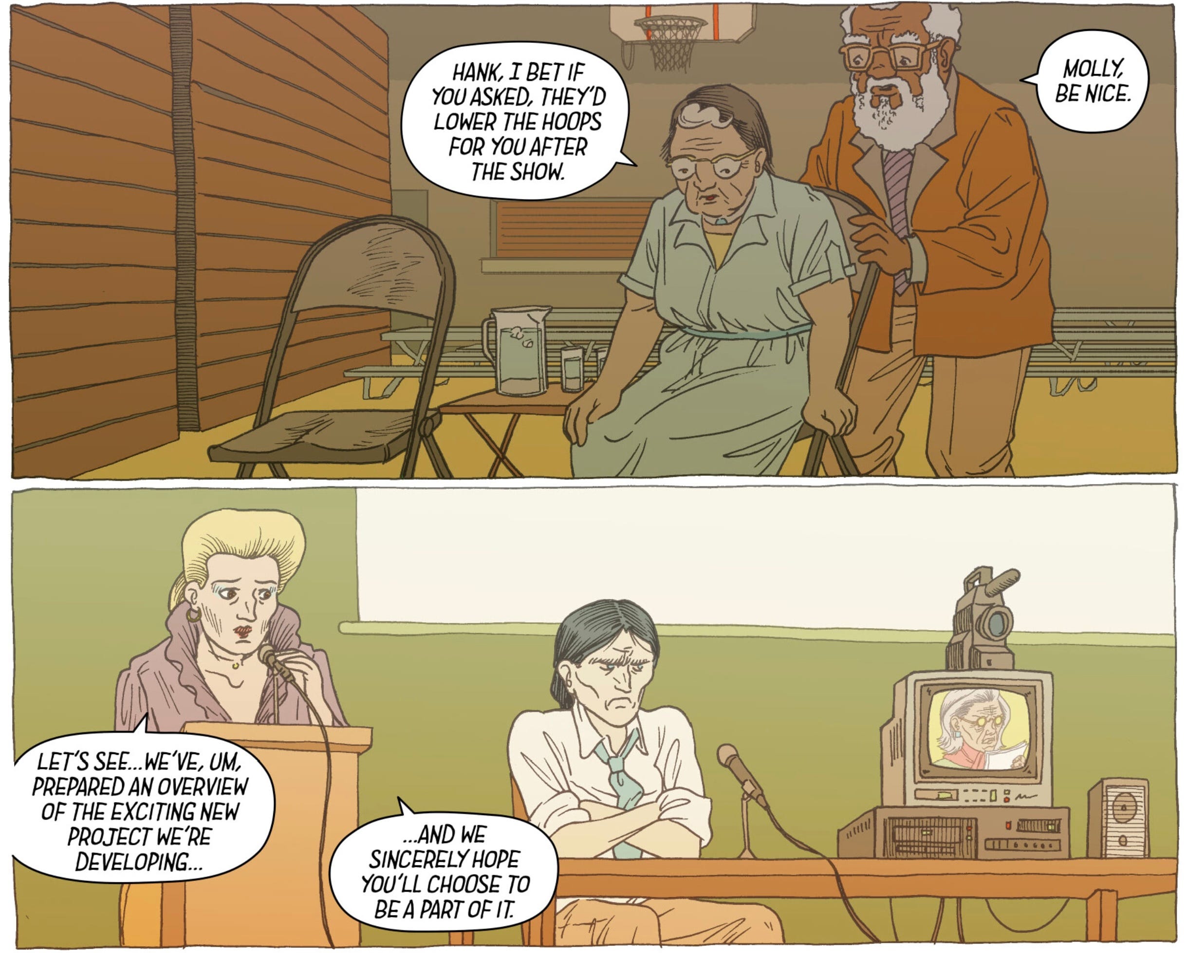
Take, for example, these panels from Kazuo Koike and Goseki Kojima’s Lone Wolf and Cub:

Here, our hero Ittō dives into the river to save his drowning son, Daigorō. The magic of comics is such that we don’t need to see every action Ittō takes to reach his struggling son: We don’t need to see him plunge fully into the water and kick himself up to the surface before swimming on. Our brain fills in information between these panels. All that we don’t see in these panels are included in this comic’s diegetic space.
A simpler example: In a panel, a Slinky is set in motion at the top of a staircase. In the next panel, we see it lying on the floor at the bottom of the stairs. We can infer what has happened between panels and don’t necessarily need to see it. Saving space like this—not showing every movement—can be an important choice in controlling the pacing of your story.
Remember: You are directing when you make comics. Each panel is a shot. And the composition of each shot is essential, not just for the narrative, but also for the flow, or how we read and interpret from panel to panel. Transitions between panels play a crucial role in storytelling, pacing, and conveying the passage of time and events.
Scott McCloud, in his seminal work Understanding Comics, categorizes these transitions into six types:
Moment-to-Moment: This type of transition depicts very short intervals of time, often showing subtle changes in the same scene or action.
Purpose: Slows down the narrative, allowing for a detailed examination of an event or action. Often used to create a sense of suspense or to highlight specific, small changes.
Example: A series of panels showing a character's eyes slowly closing.
Action-to-Action: This transition shows a single subject progressing through a specific action.
Purpose: Moves the story forward by focusing on significant actions or movements, often used in action sequences or to demonstrate cause and effect.
Example: A panel showing a character winding up to throw a punch, followed by a panel of the punch connecting with its target.
Subject-to-Subject: This transition involves a shift between different subjects within the same scene or context.
Purpose: Provides different perspectives within the same scene, helping to build a more comprehensive understanding of the environment or situation.
Example: A panel showing one character speaking, followed by a panel of another character reacting.
Scene-to-Scene: This transition covers a significant amount of time and/or space, often moving between different settings or points in time.
Purpose: Advances the narrative significantly, often used for transitions between chapters or major shifts in the story.
Example: A panel depicting a character leaving home, followed by a panel of them arriving at a distant location weeks later.
Aspect-to-Aspect: This transition shifts between different aspects or elements of a place, idea, or mood.
Purpose: Provides a more atmospheric or thematic exploration of a scene, often used to set the mood or tone rather than to advance the plot.
Example: Panels showing various details of a busy marketplace—the stalls, the crowd, the products—without focusing on the narrative progression.
Non-Sequitur: This type of transition lacks a logical or narrative connection between panels, creating a jarring or surreal effect.
Purpose: Can be used to evoke a sense of disorientation, highlight contrasts, or create abstract or avant-garde storytelling.
Example: A panel showing a serene landscape, followed by a panel of a spaceship in outer space with no apparent connection between the two.
While you don’t need to have the names of these transitions memorized, it’s important to understand how their inclusion changes the meaning of your narrative.
Let’s look at two panels from Ezra Claytan Daniels’ Upgrade Soul and see examples of these transitions on the page:
Same physical location, but shifting perspectives? This is a subject-to-subject transition.
One more example, this time from Mike Mignola’s Hellboy in Hell:

Hellboy wandering, and various elements of this damning landscape presented to us? A combination of aspect-to-aspect and scene-to-scene.
So, what about shots, and how do film and TV factor into this conversation?
While understanding shots and angles is crucial for effective visual storytelling—as they further influence how the reader perceives the scene, characters, and emotions—they are also decidedly more complicated to master.
Enter: Adaptation.
Don’t know where to start? Try this: Find a film (or TV show) you love and know well. Find a single scene that speaks to you. Your job: Adapt the scene into comic form. Think about it this way: The director, this final product, has already been created. Shots have been chosen and edited together for specific purposes. As you watch your scene, ask: Why does this shot work? Why put the camera here? How do these choices affect my viewing and understanding of the story? Why did the director do this?
This is a great introduction to shots and angles and learning what works and why—which you can immediately put to use in your comicsmaking.
Let me show you what I did with one of my all-time favorite films, Jonathan Glazer’s Sexy Beast (2000). This is a deceptively complex crime film about a man coerced into doing one last bank job. Let’s look at the scene in question:
As the film starts, Ray Winstone’s Gal Dove has retired to Spain with his wife. He has a cushy, peaceful life. They have good friends. They go out and eat and drink and dance. Gal has very little to worry about other than the beating sun, how his tan is coming along, and how clean his pool…until a boulder, freed from its place atop the hill behind his house, lets loose and nearly misses him, flying by his head and landing with a massive splash in the nearby water.
This boulder represents a sudden disruption to Gal’s new life that will manifest later as the despicable, psychotic Don Logan (played by Ben Kingsley) shows up to bring Gal back into the fold.
Here's how I start my adaptation of this opening scene.
Panel 1: The sun.

This seemed obvious to me. Gal’s quiet life, where he gets to focus only on his suntan, is front and center. We can feel the heat. The scene starts with a sun, so we will, too.
Panel 2: Gal’s house and property.
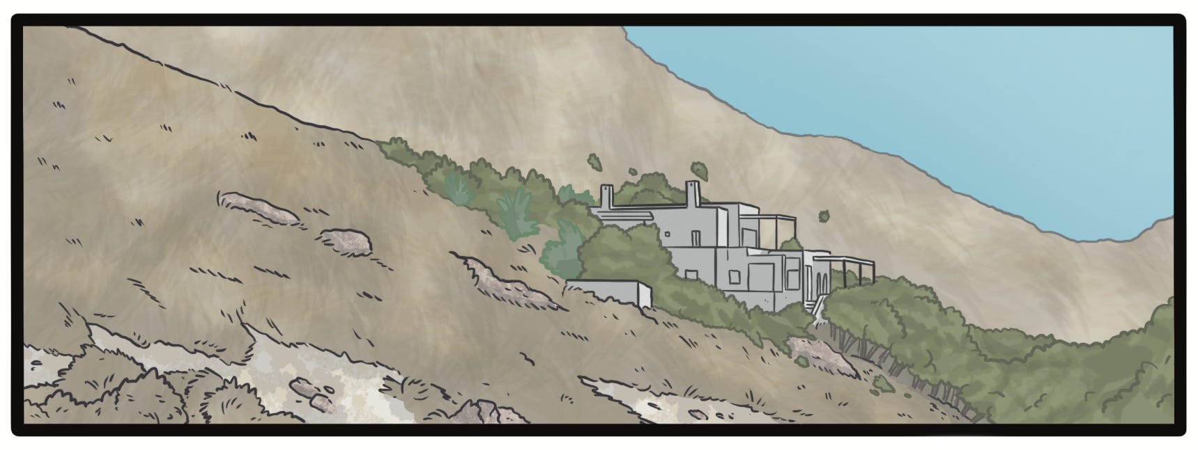
We don’t see a wide shot of Gal’s property in this scene until a bit later. But thinking about how to translate this into comic form, I wanted to move this wide shot near the beginning of the page. Why? We see the sun, and now we see the sun-baked landscape where Gal has retired, alone in the Spanish countryside. In a static medium, this shot will help us further feel the heat and Gal’s isolation and understand the (coming) pressure he’ll soon face.
Panel 3: Gal, tanning.

Here, our first glimpse of Gal Dove. An overhead shot again reinforces how isolated he is, even at his home, with nothing around him but open deck. This is the life he’s created for himself in Spain, one far removed from his criminal days back in England.
Panels 4-6: Enrique the pool boy, Gal sitting up and reaching for an ice-cold cloth.
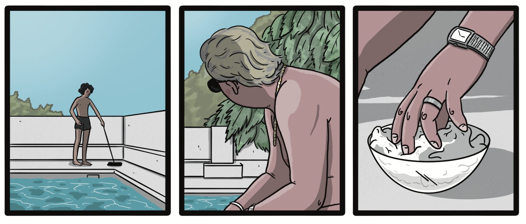
Here, a combination of moment-to-moment and aspect-to-aspect transitions help set the scene further, showing his tanning interrupted by the pool boy Enrique lazily cleaning (and Gal feeling the need to chastise), and then Gal taking the opportunity to cool off with a damp cloth. The actor Ray Winstone has such an interesting face and vibe, I want to avoid any close-ups for the moment, building some suspense in that regard. While he has a fondness for the pool boy, Gal wants him to earn his money and allows his perceived shoddiness—something that, in Gal’s previous life, would have landed him in prison or worse—as a defect. He wants to help. He wants to impart a wisdom of practicality to the boy so that he, too, may be able to someday retire like him. Then, a close shot of Gal’s hand reaching for the cloth in the bowl of cool water: again isolation, the collision of his two worlds (jewelry = his past, the deck, Gal’s shadow = his present).
Like the second panel, I’ve taken some liberties here, moving a few of the elements around to help land on the same basic ideas of the film scene, but in a flow that, I think, works better in comic form.
Now, if we put it all together with Gal’s famous voiceover narration, this is what we end up with:

Through this exercise, I can better understand decisions being made from shot to shot and also how and why I might make different ones. Once you feel comfortable unpacking your chosen scene, a great next step is to change up the shots and play with the order of things in a new way that’s entirely you. Inevitably, comics have less room to make their mark than a film—every panel and page counts—so learning flow and pacing in our work by examining what we keep in or leave out is a necessary next step in your comicsmaking journey.

What a cool comics exercise and example!